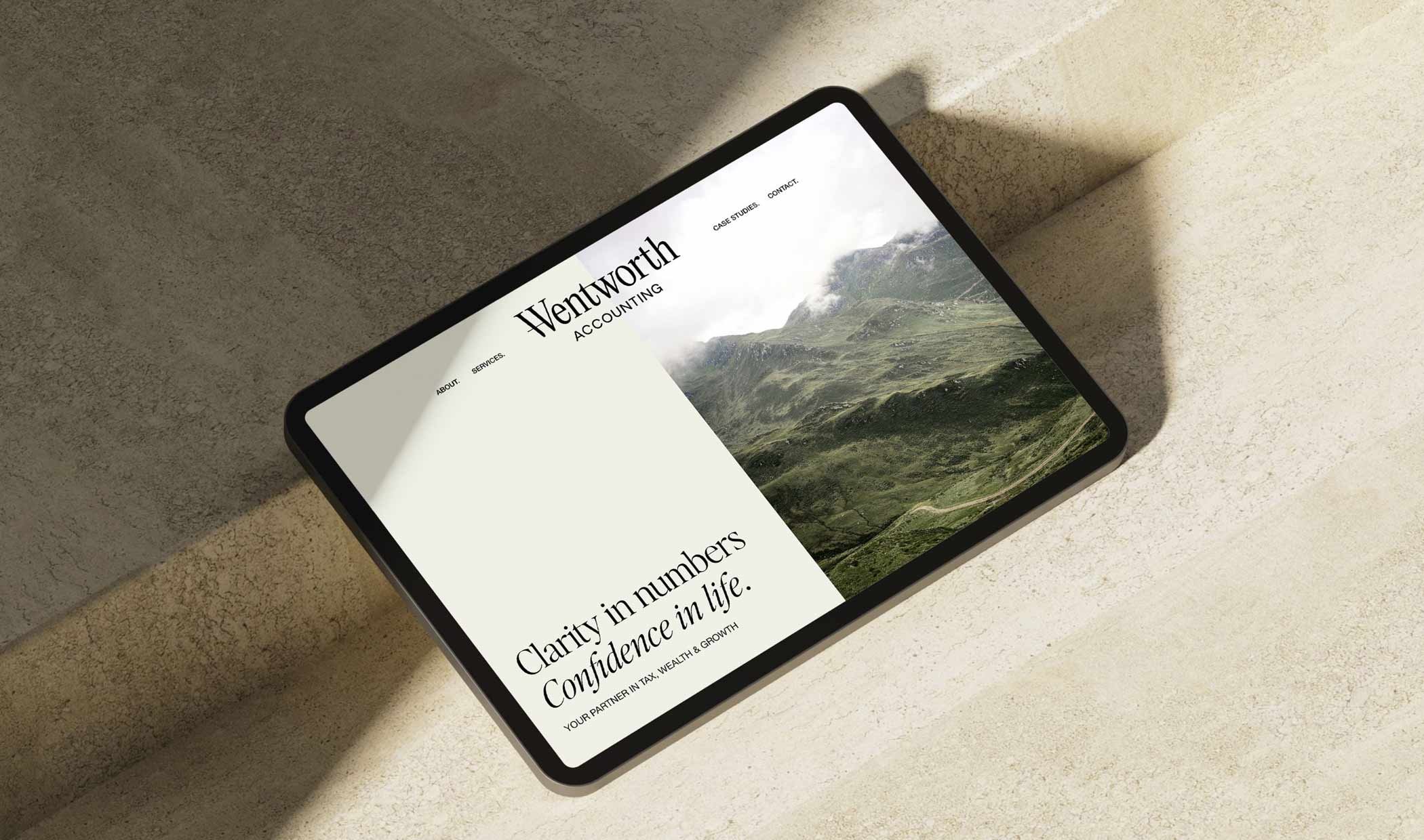
Wentworth Accounting
When Bridgid from Wentworth Accounting approached us, she was ready for a complete brand transformation. She wanted something that felt contemporary yet classic, refined yet approachable. At its core, the brand needed to communicate trust and expertise while reflecting the firm’s ethos of: “giving individuals, families and businesses the confidence to make smart financial decisions and live abundantly.”
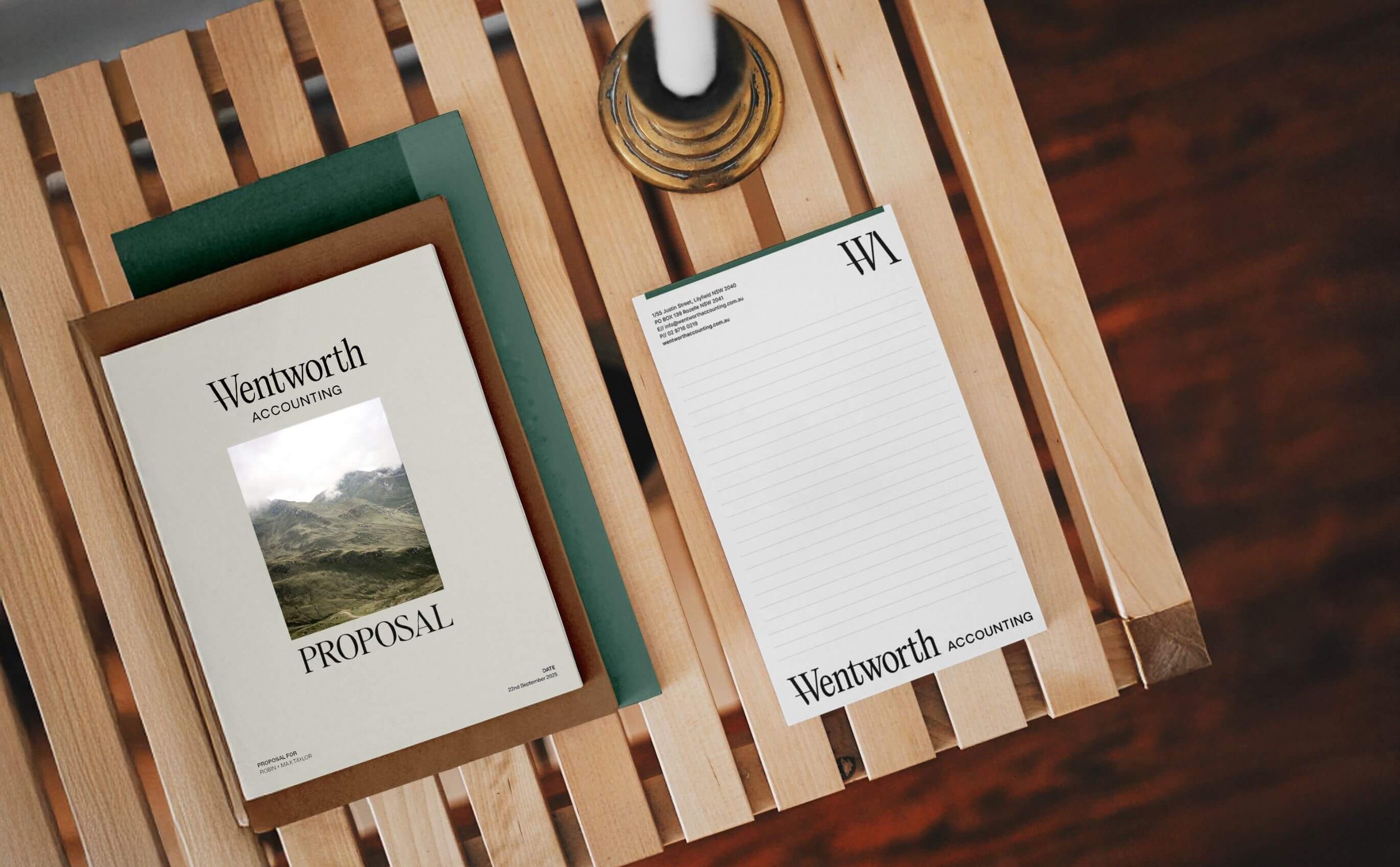
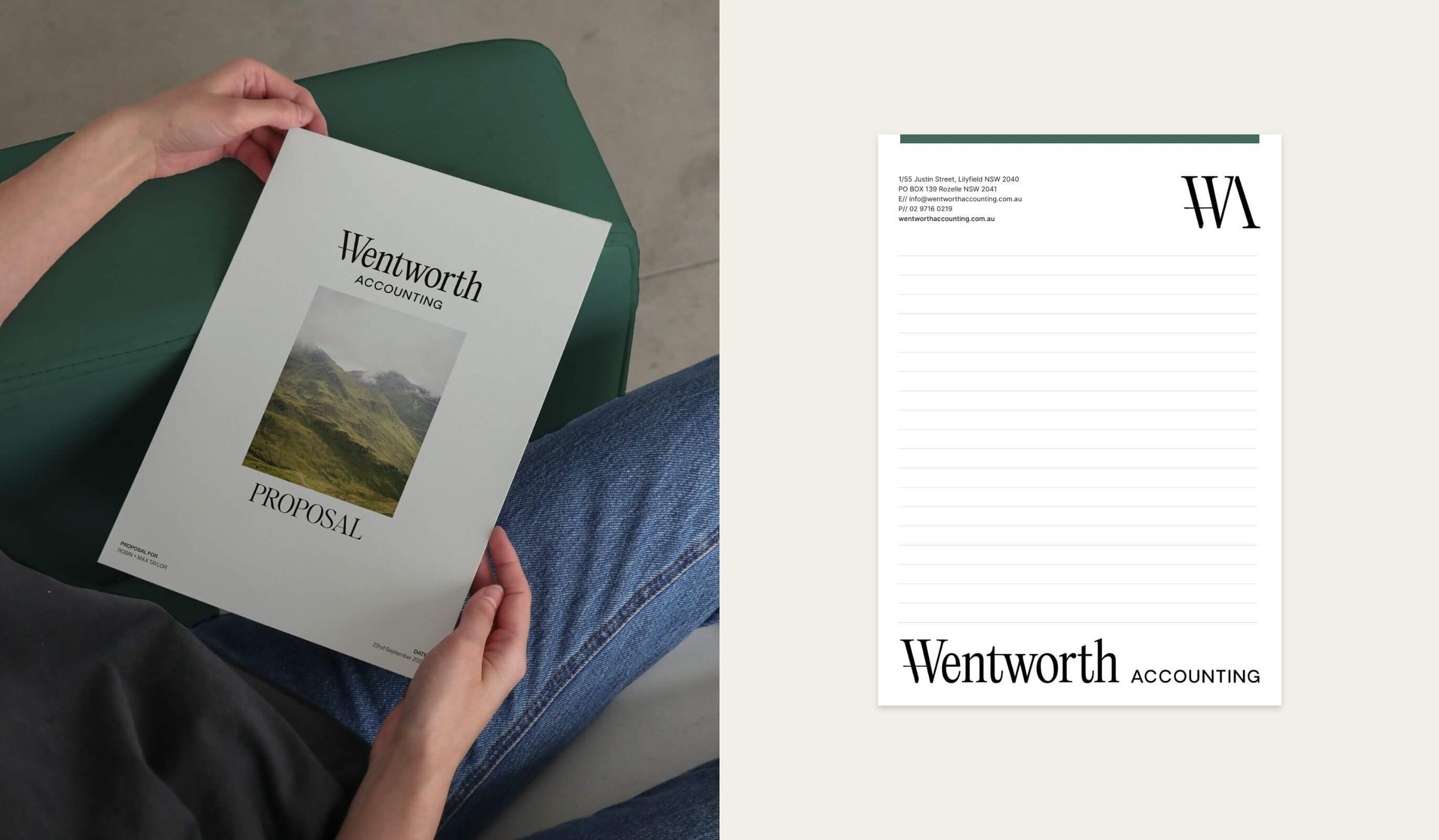
STATIONERY DESIGN
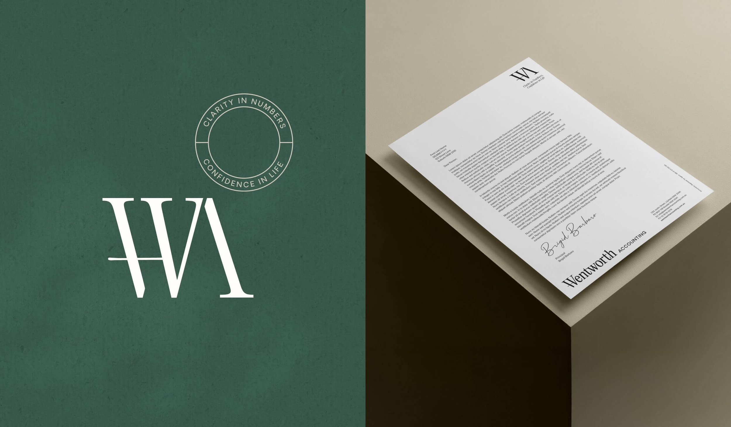
We began by developing a timeless logo that balances sophistication with accessibility. The elegant, refined typography grounds the brand in professionalism, while the custom “W” mark serves as both a distinctive symbol and an anchor. Designed with the precision and polish of a cufflink, it hints at tradition with a modern twist.
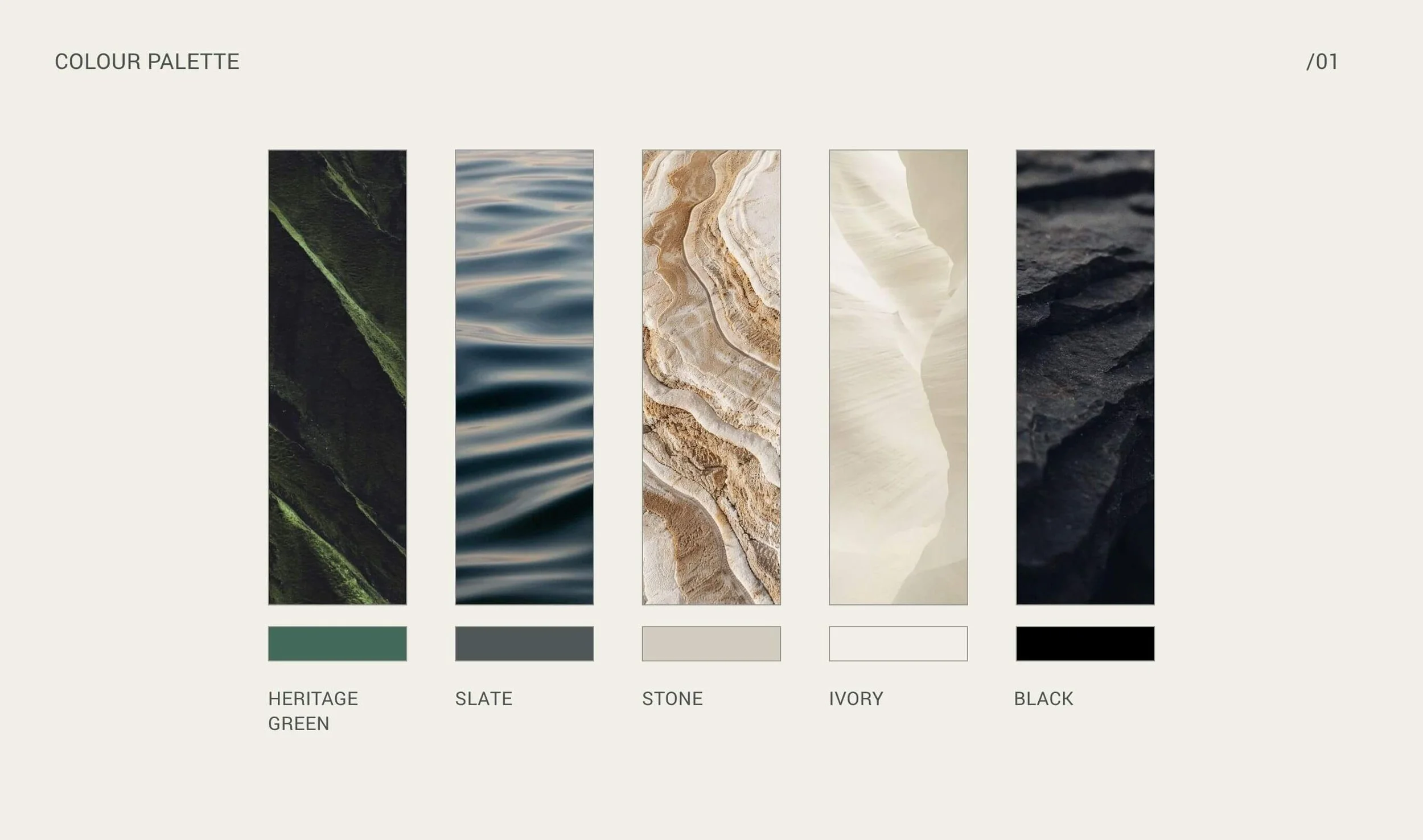
From there, we built a colour palette that felt intelligent and intentional. A desaturated forest green was chosen to convey stability, trust and growth, qualities central to financial confidence, while soft neutrals balance the palette with warmth and understated sophistication. The result is a colour story that is refined but never pretentious, perfectly aligned with Wentworth’s values.
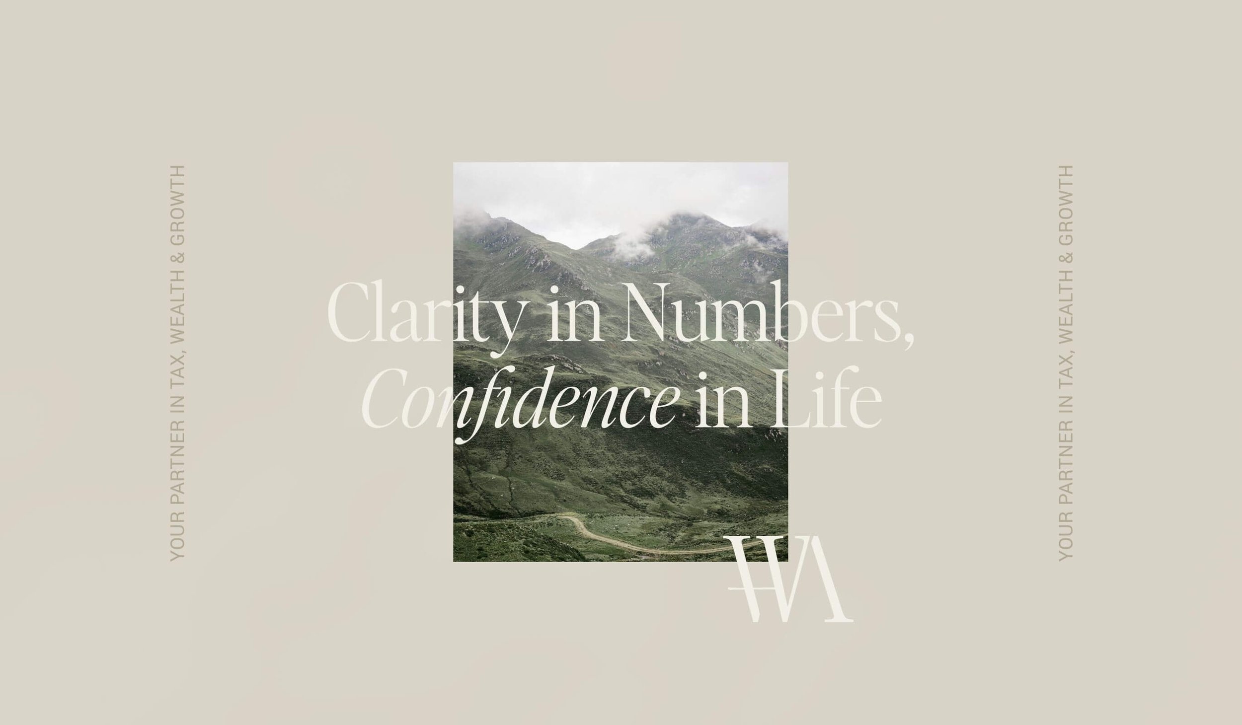
The finished brand identity is classic, confident and built to last. It provides Wentworth Accounting with a cohesive visual presence that clients can instantly trust and connect with, capturing not just what the business does but the reassurance and growth it helps foster.


Zoe drew out elements of my own identity, values and style; and translated them into a brand that feels refined and elevated, yet still warm and approachable.
I wanted a brand that’s forward-thinking accounting and far from a stock-standard dated accounting look. The brand feels considered and genuinely who I am. It’s the experience I want my clients to have.
Her communication was spot on, her direction was clear, and she kept me accountable in all the right ways - which was exactly what I needed to get this project over the line.
Highly recommend Zoe and The Design Order team.