Odellan
We loved bringing this beautiful new skincare brand to life: one that’s wholeheartedly aligned with what we stand for- conscious, earth-connected and committed to creating products that are helpful, not harmful.
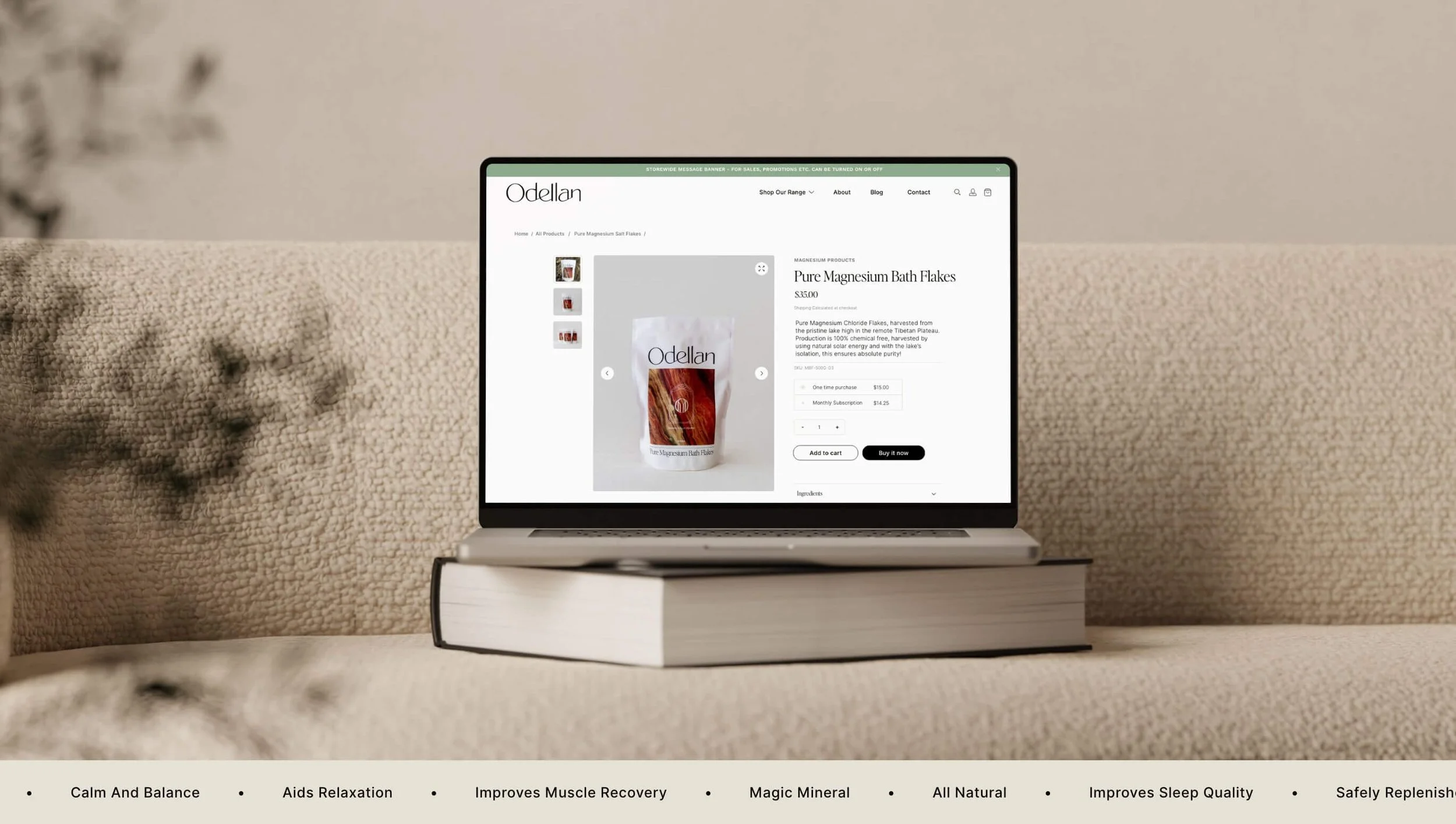
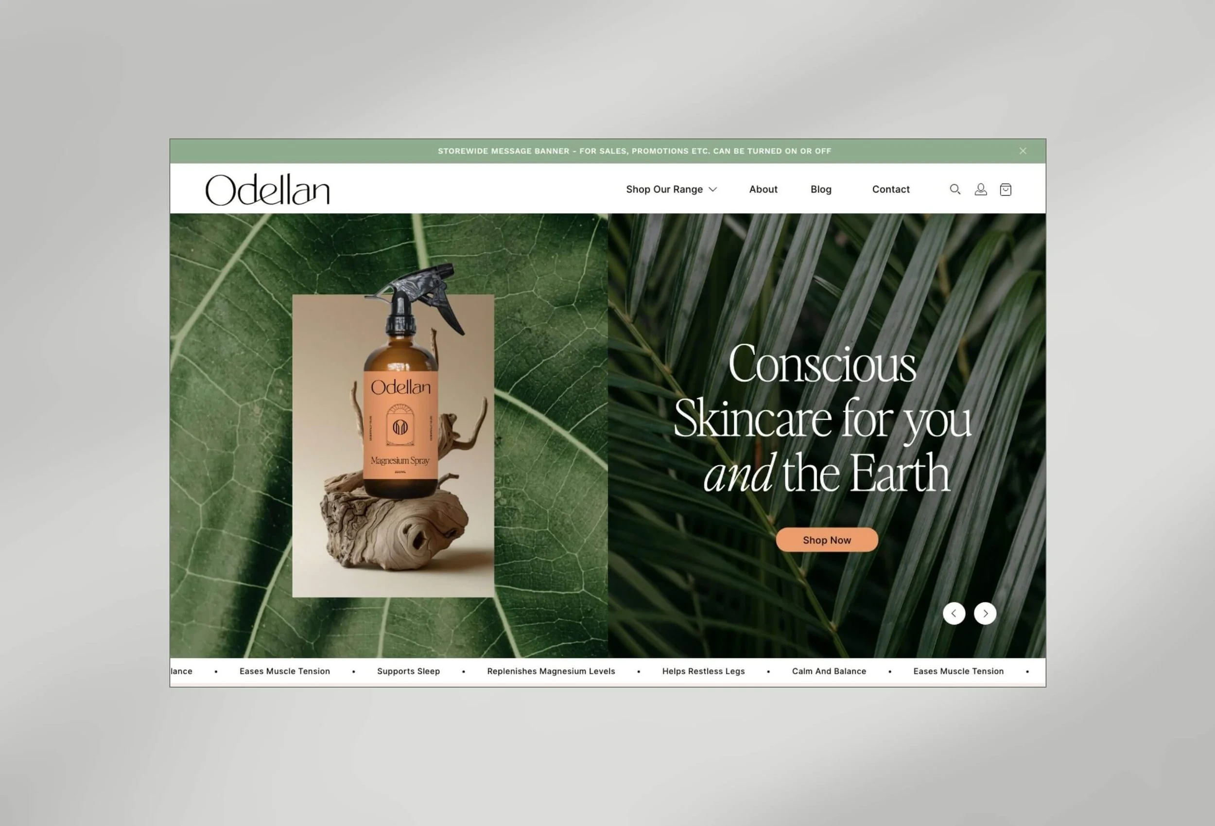
WESBITE DESIGN
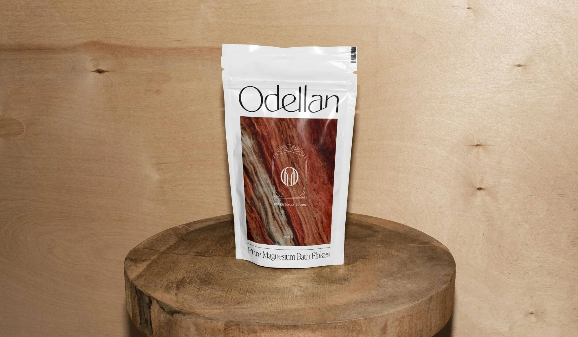
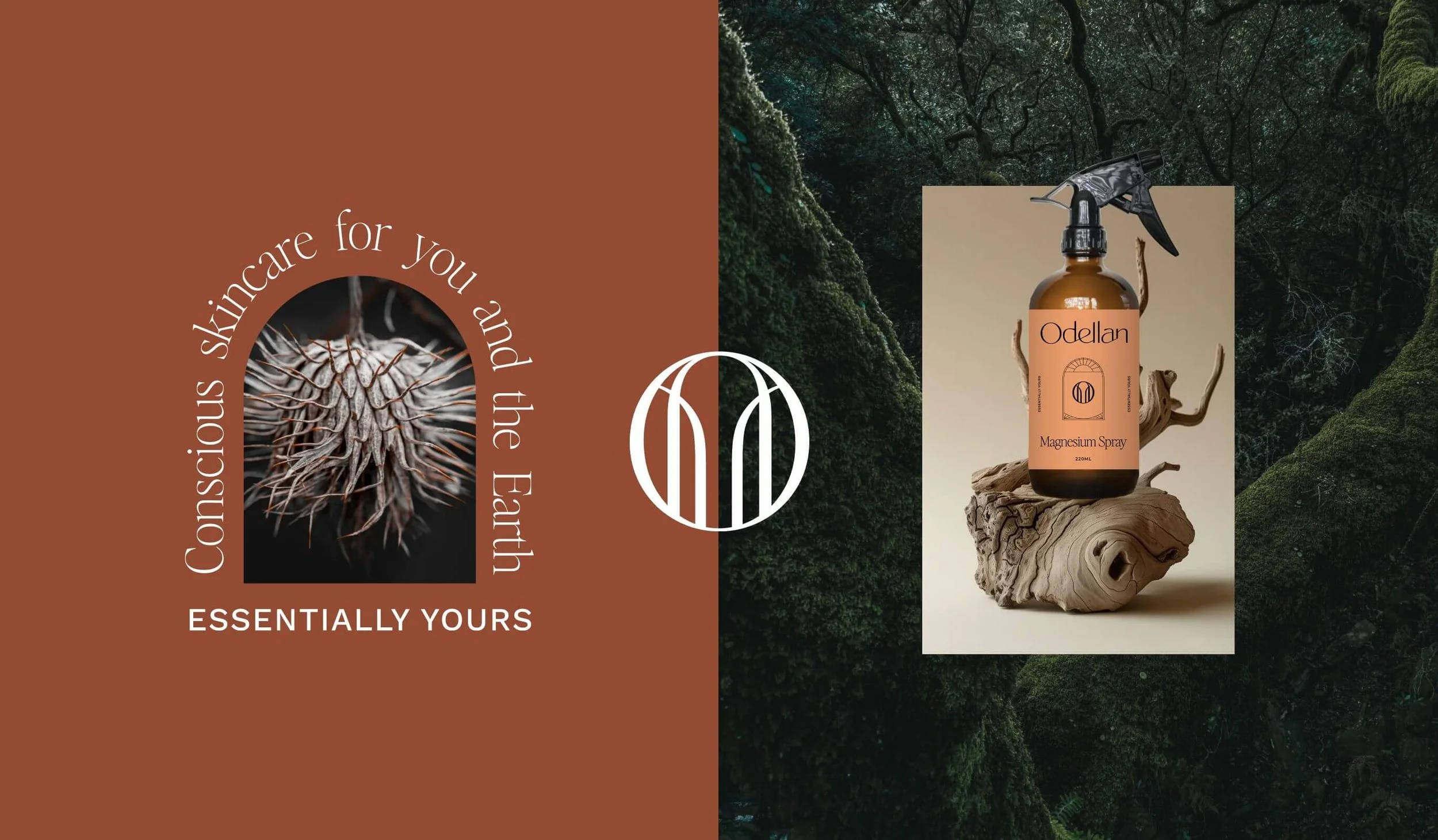
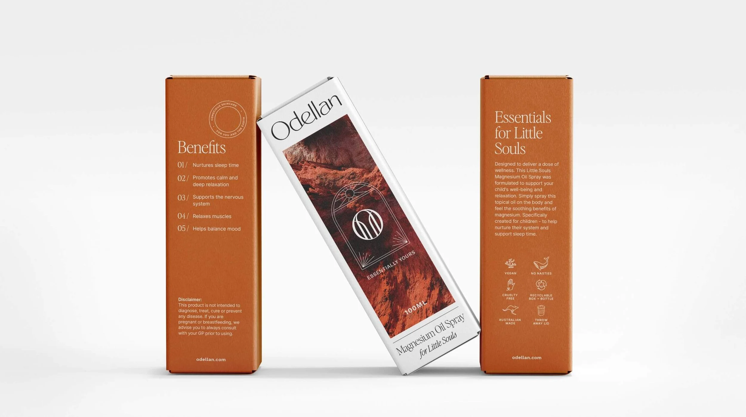
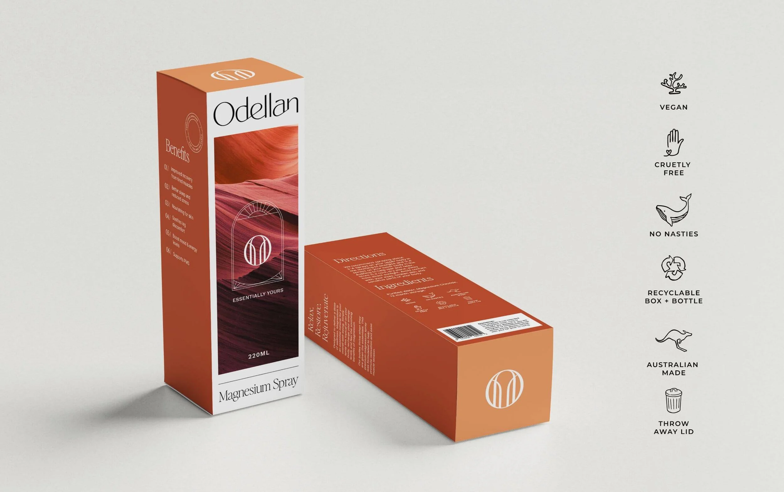
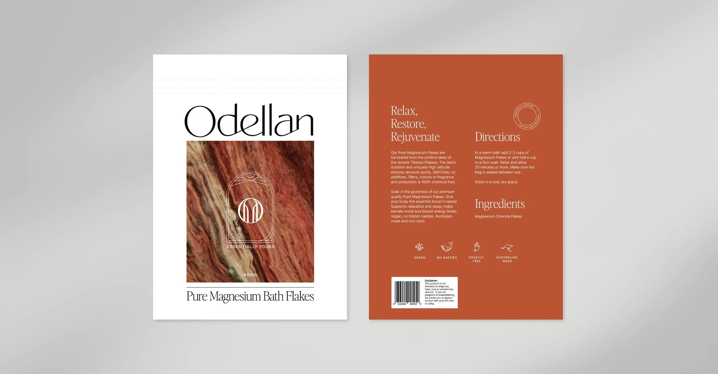
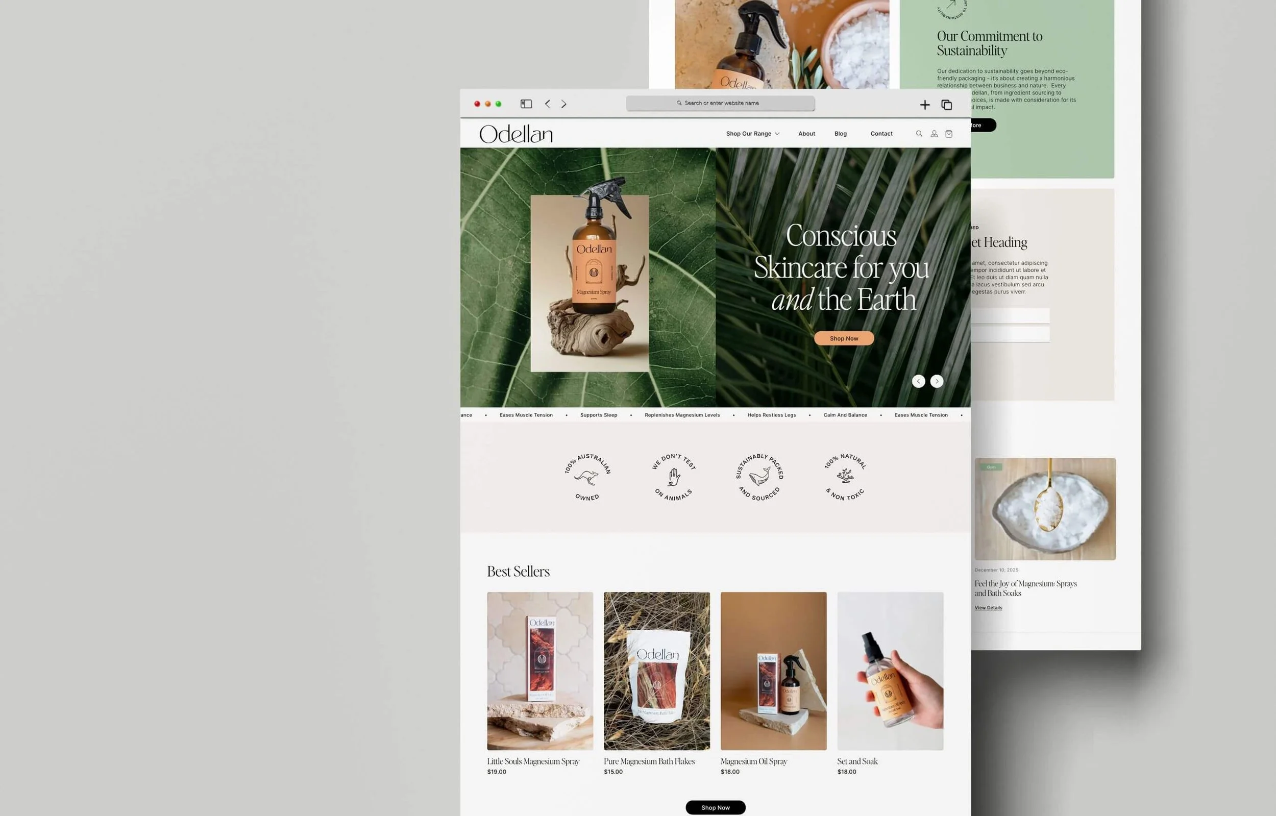
Launching with a range of magnesium sprays (with perfumes and more to follow) the brand’s ethos is rooted in nature: graceful, grounded and dependable. They wanted their identity to embody connection, a distinctive presence and an earthy, tactile feel. Our mission was to create branding and packaging that communicated all of this - authentically and effortlessly.
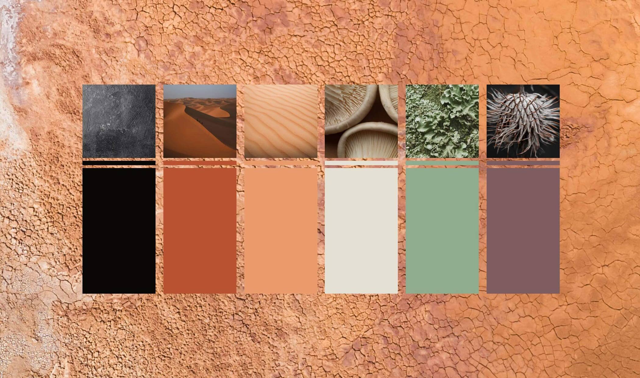
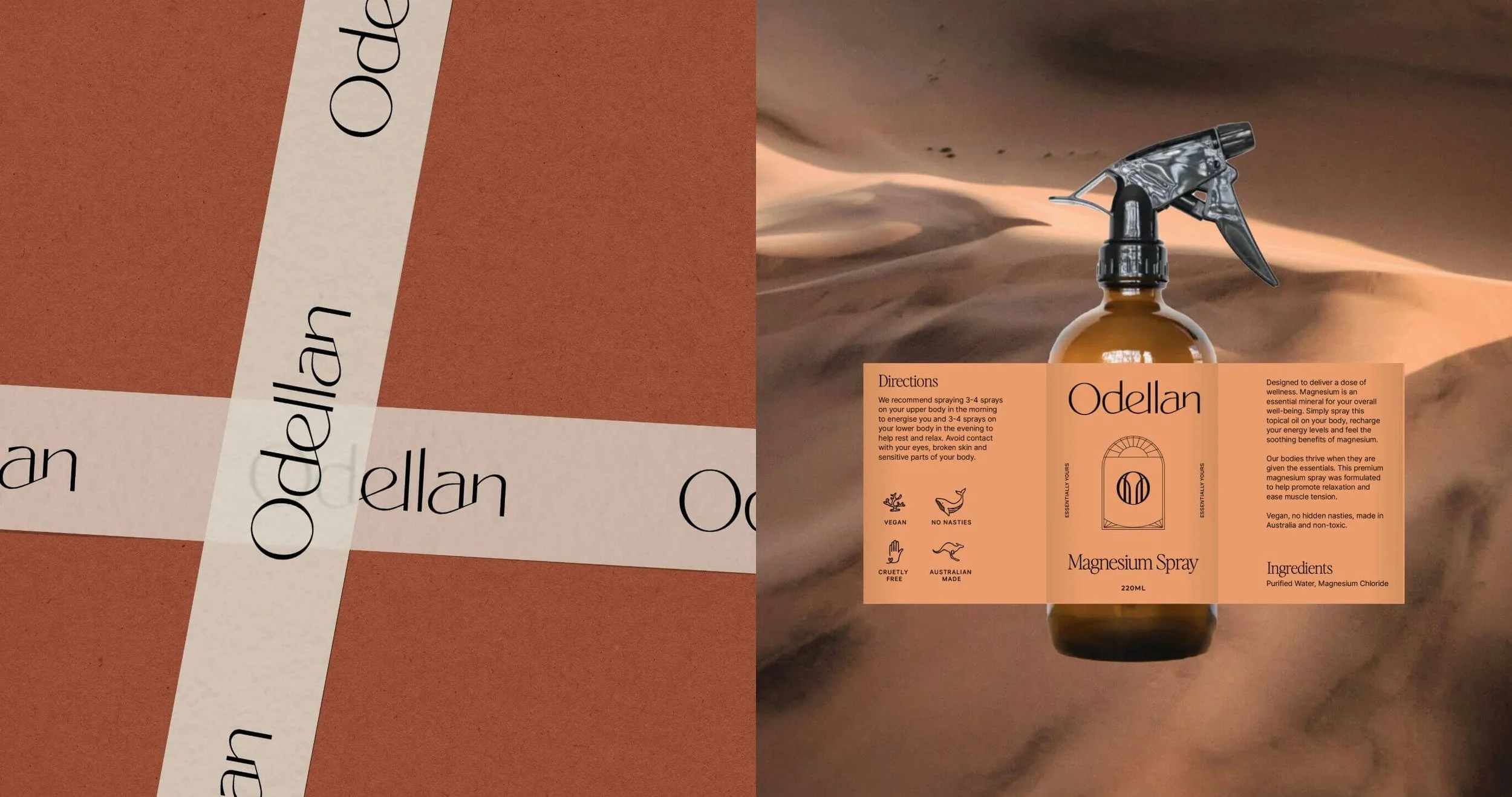
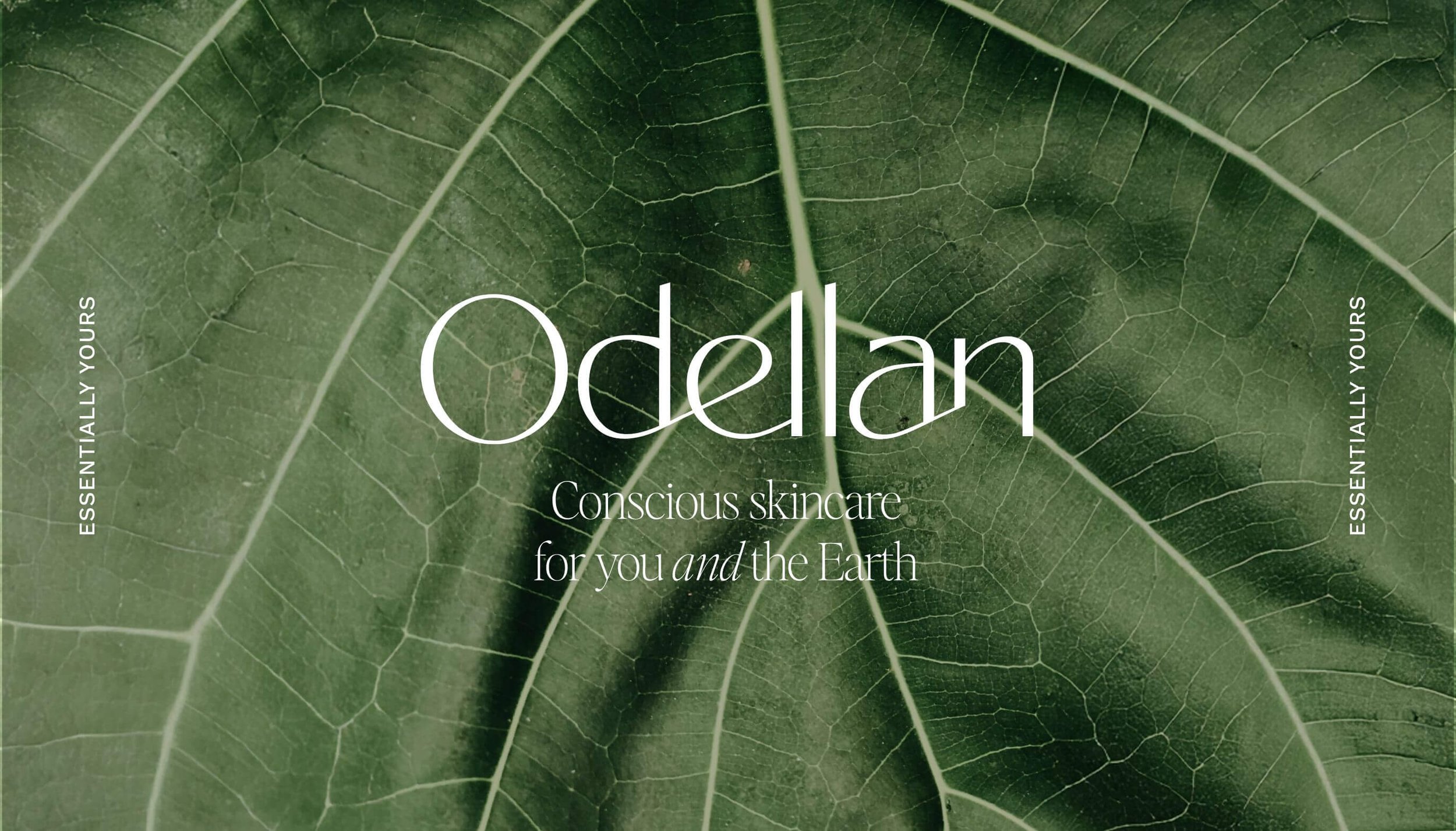
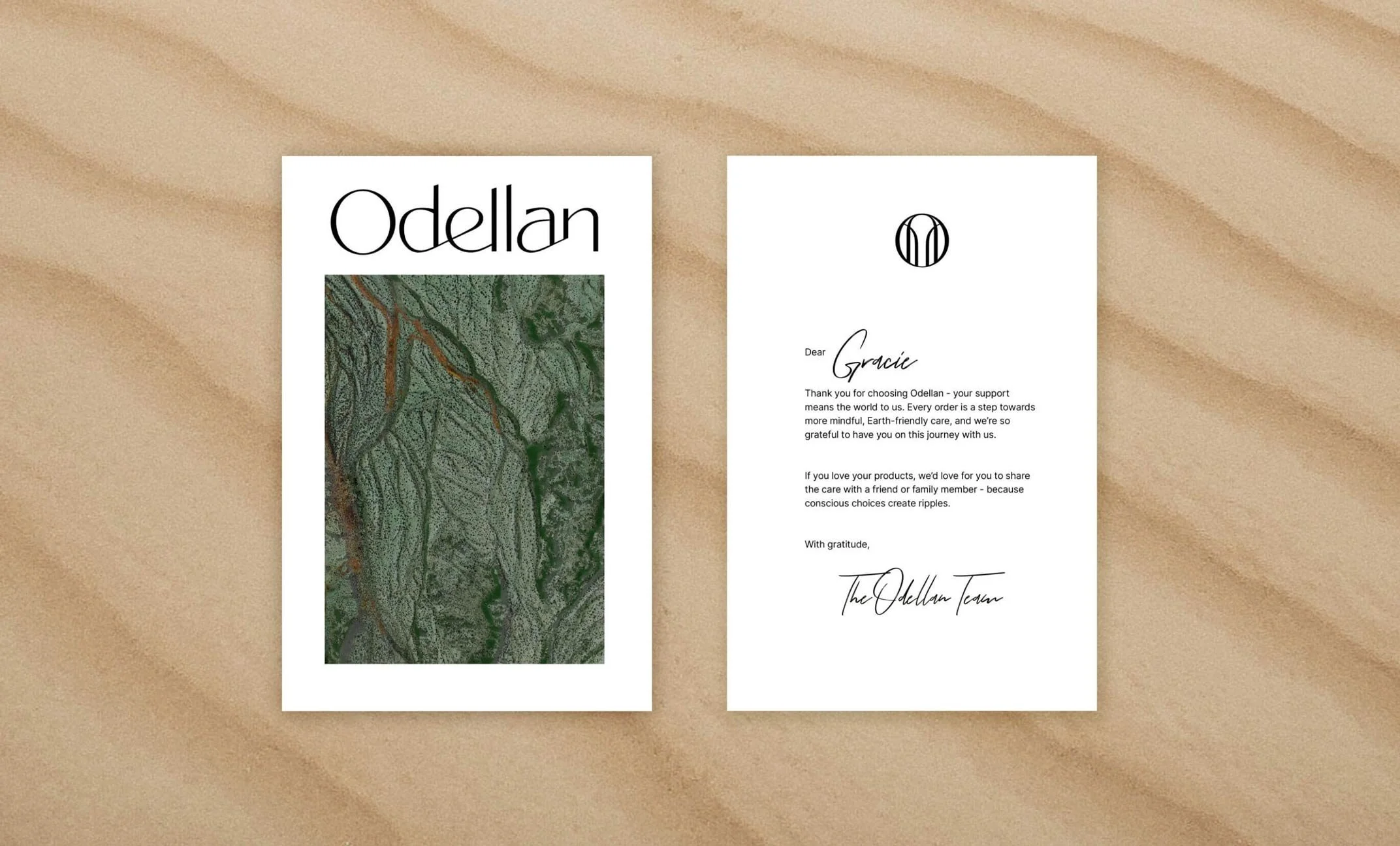
We began with a flowing, modern logo featuring custom typography that strikes a balance between delicacy and strength. From there, we layered in nature-inspired textures and imagery to give the brand a warm, organic aesthetic. The earthy Australian colour palette adds depth and richness, while also ensuring the product stands out on shelves and invite people to pick them up.
A unique touch is Zoe’s hand-illustrated icons, designed to add character and a sense of uniqueness to the identity. The typography pairing combines a refined sans serif with a more contemporary, slightly edgy typeface: blending elegance with modernity.
We also created a distinctive brand icon symbolising open hands and a sense of flow and giving. Each product features a unique bohemian-style frame variation, creating visual consistency while allowing subtle individual expression across the range.
The final result is a brand identity that honours this skincare label’s core values - earthy, conscious, and genuine. It’s designed to resonate with those who crave honesty and soul in a space that’s often saturated with over-promises and under-delivery.
Collaborators:
Development - Croissant & Baugette


Each of our designs, created by Zoe, are both aesthetically pleasing and strategically sound. Collaboration with The Design Order team was an absolute breeze - they're responsive, open to feedback, and always willing to iterate until our vision was perfect. The culmination of their hard work is evident in our new packaging, which is absolutely beautiful and instantly recognisable on the shelf. Thanks to their expertise, our brand now shines!