Michelle Broadbent
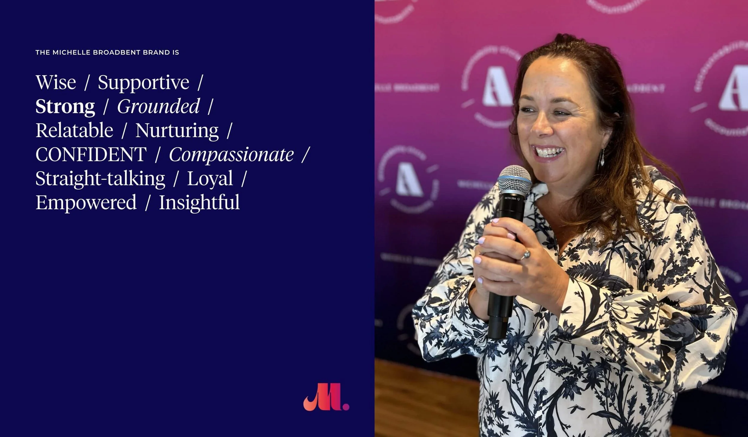
Michelle Broadbent is a powerful business advisor, so her brand design needed to capture her vitality, tenacity and charismatic confidence. It needed to be vibrant, bold and trustworthy, positioning her as a leader who offers both mentorship along with 1:1 coaching.
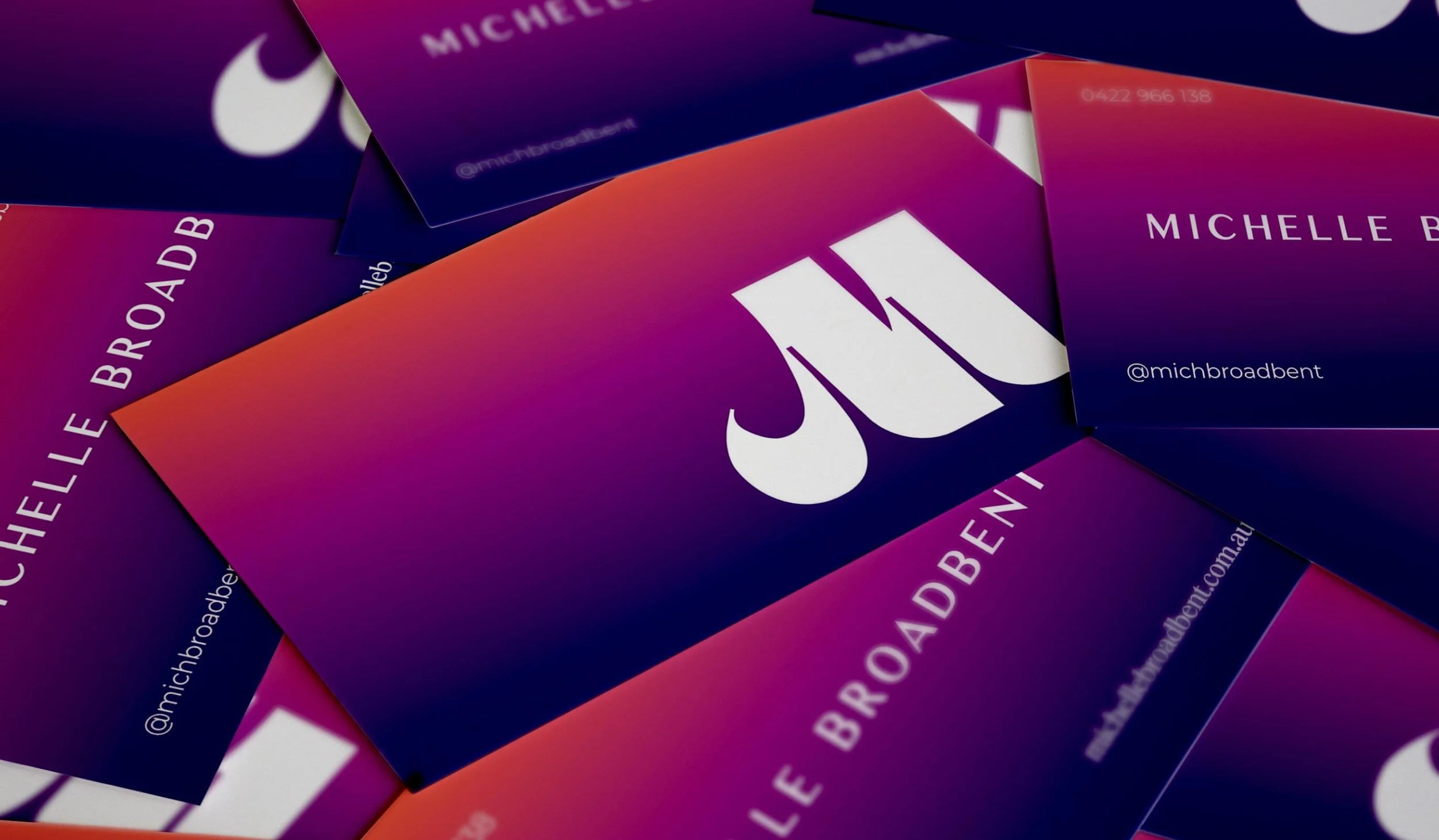
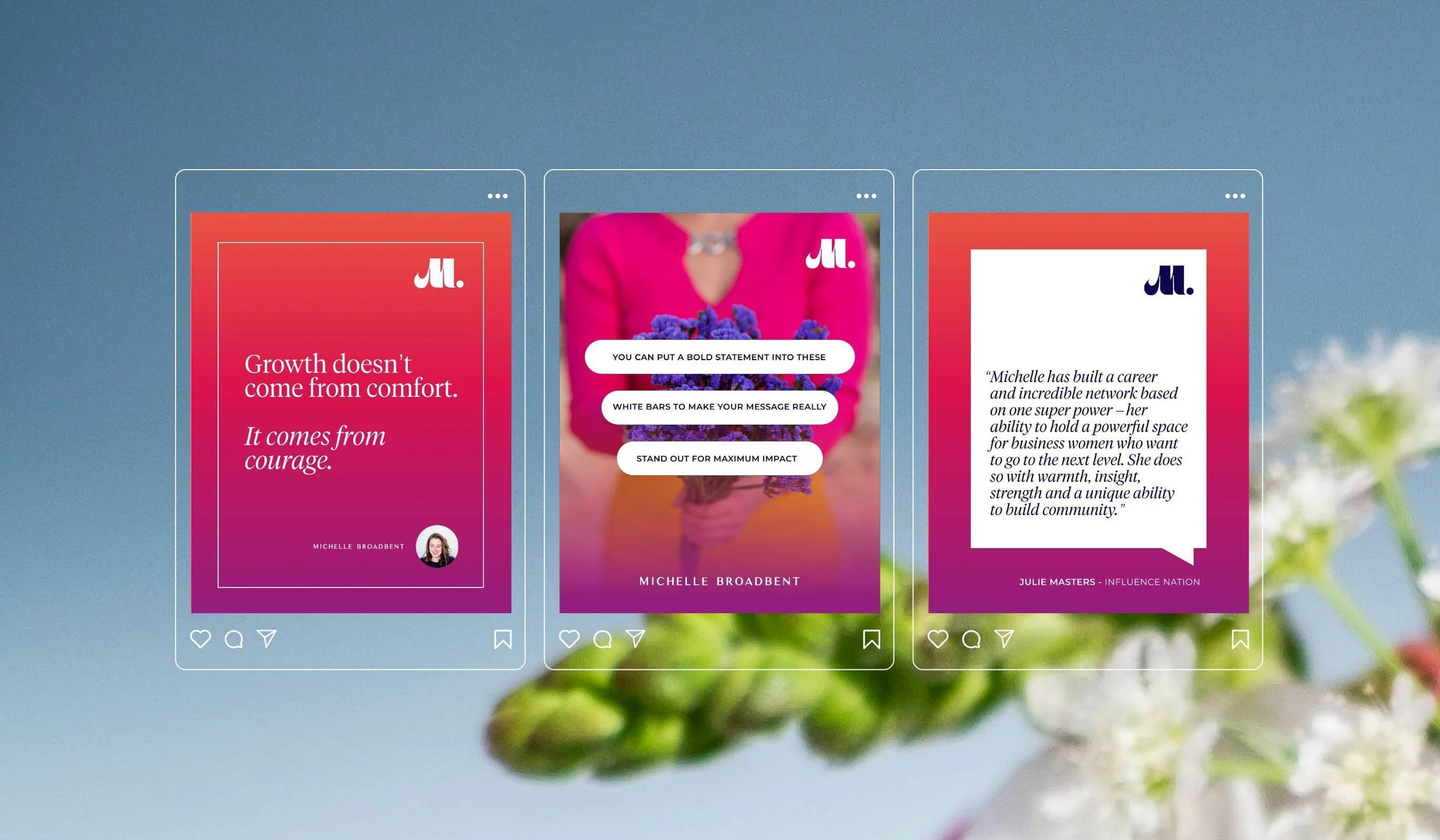
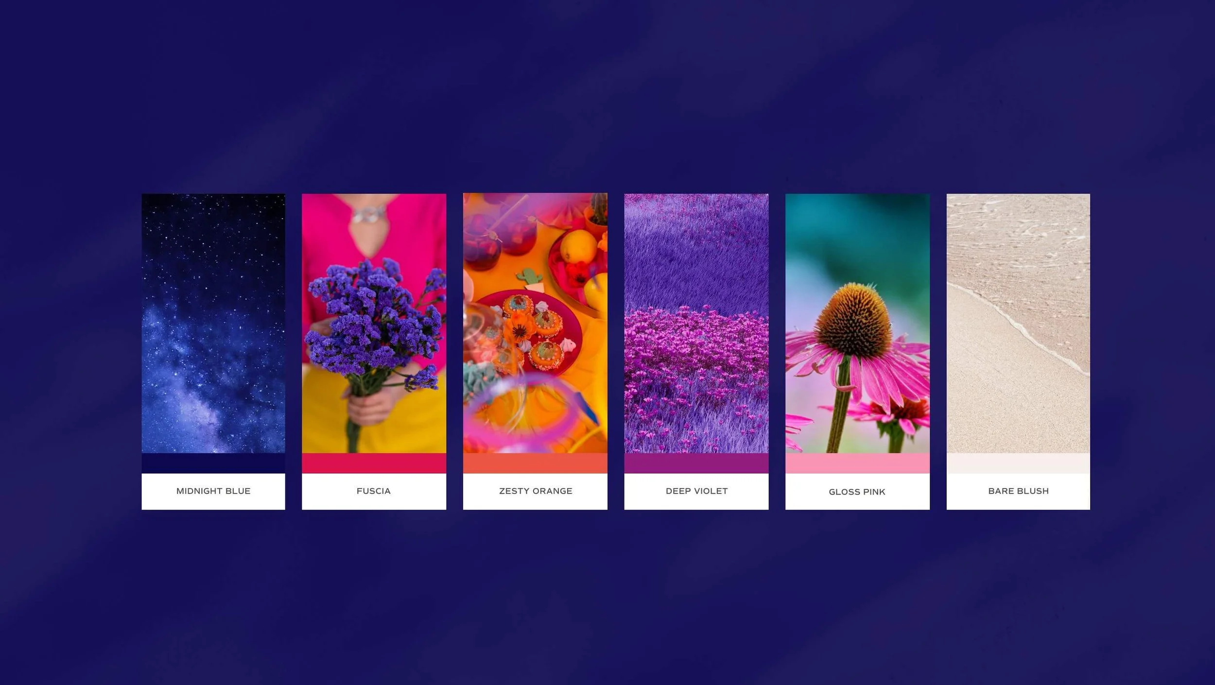
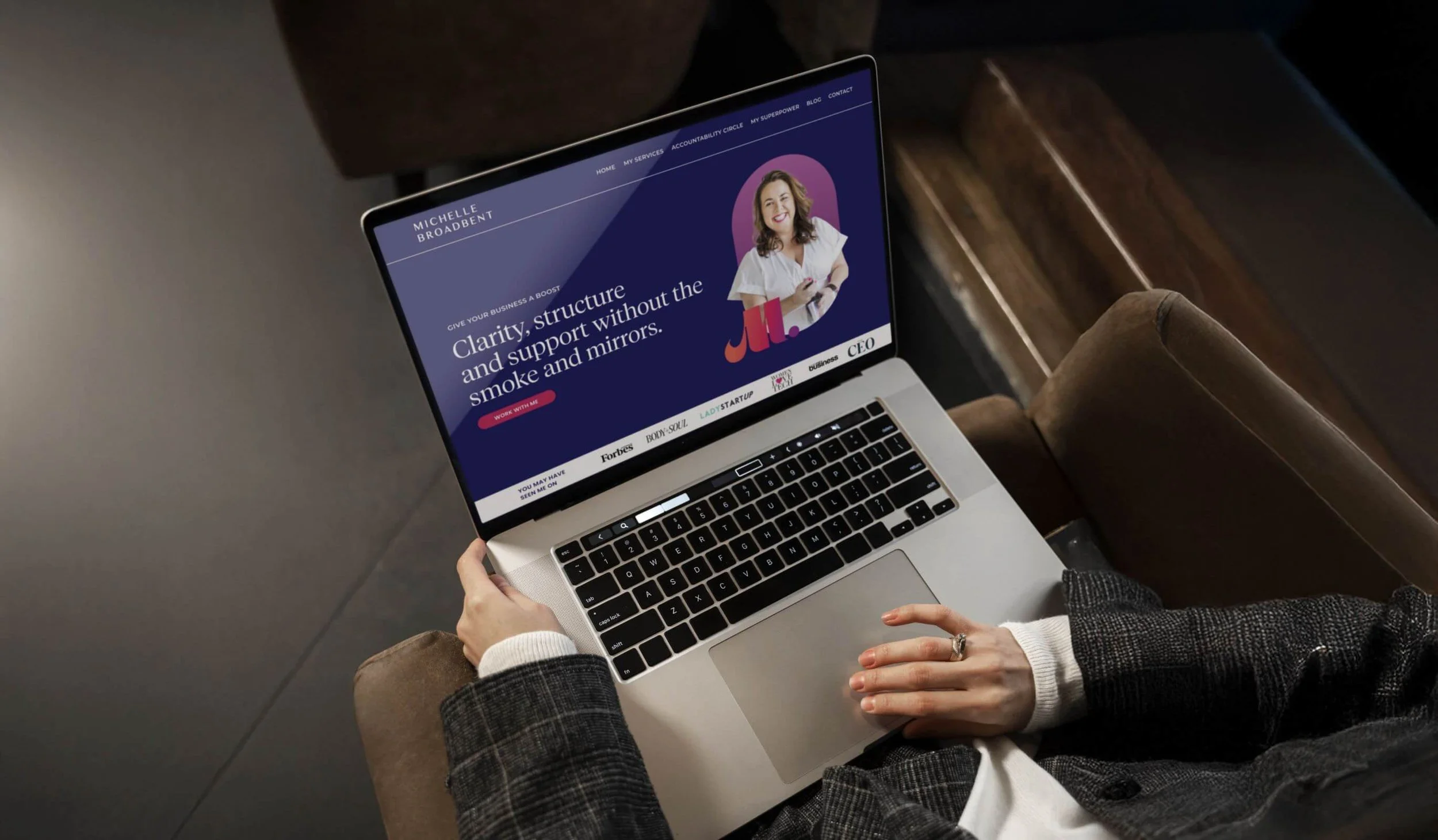
We developed a punchy colour palette that was loud, bright and heavily saturated, anchored by a trusting blue and complemented with a bold magenta, playful pinks, energetic orange and deep purple. Together, these tones create a warm embrace, just like Michelle herself. To inject an extra layer of dynamism, we used gradients across the palette to give the brand a modern, energetic edge.
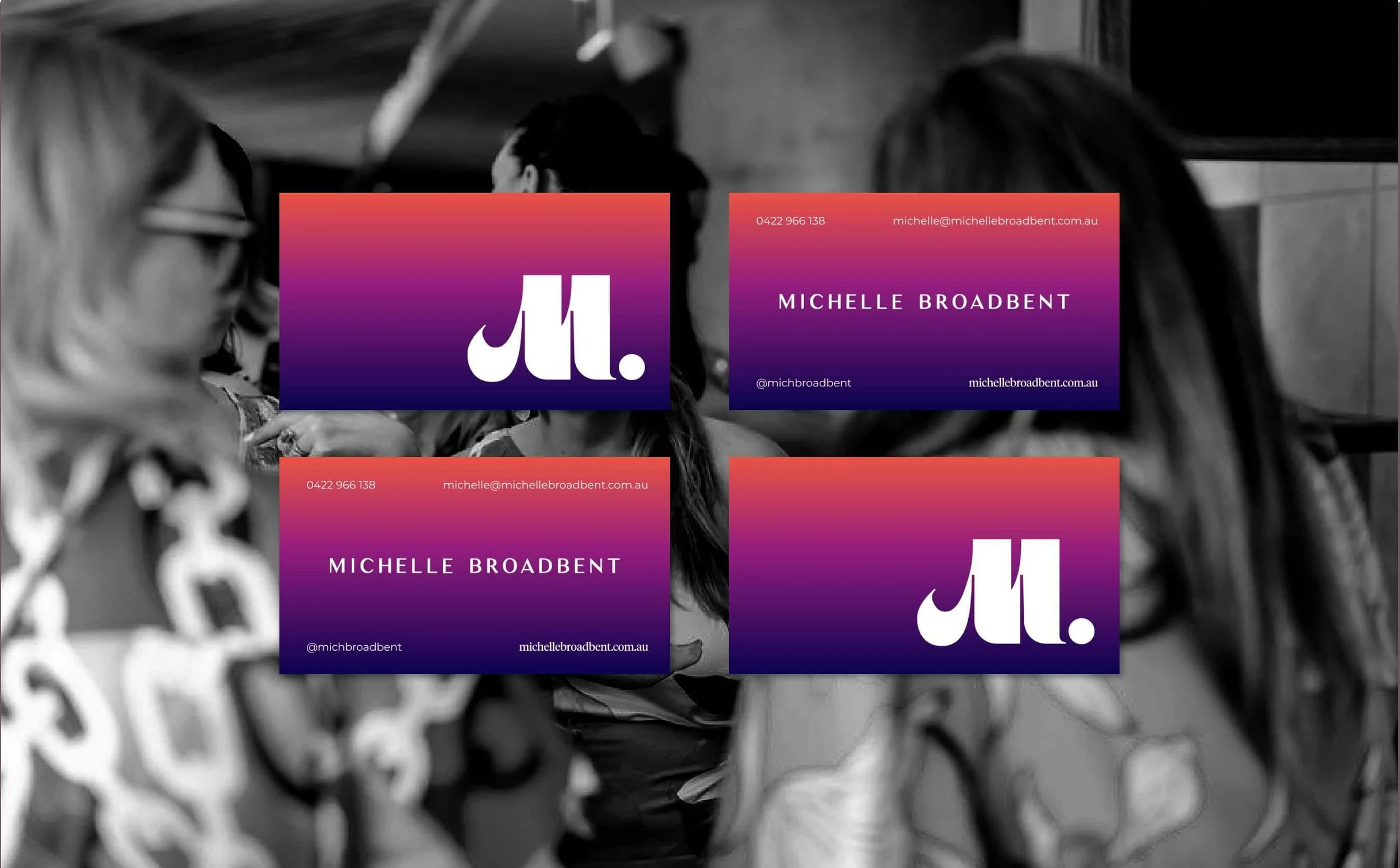
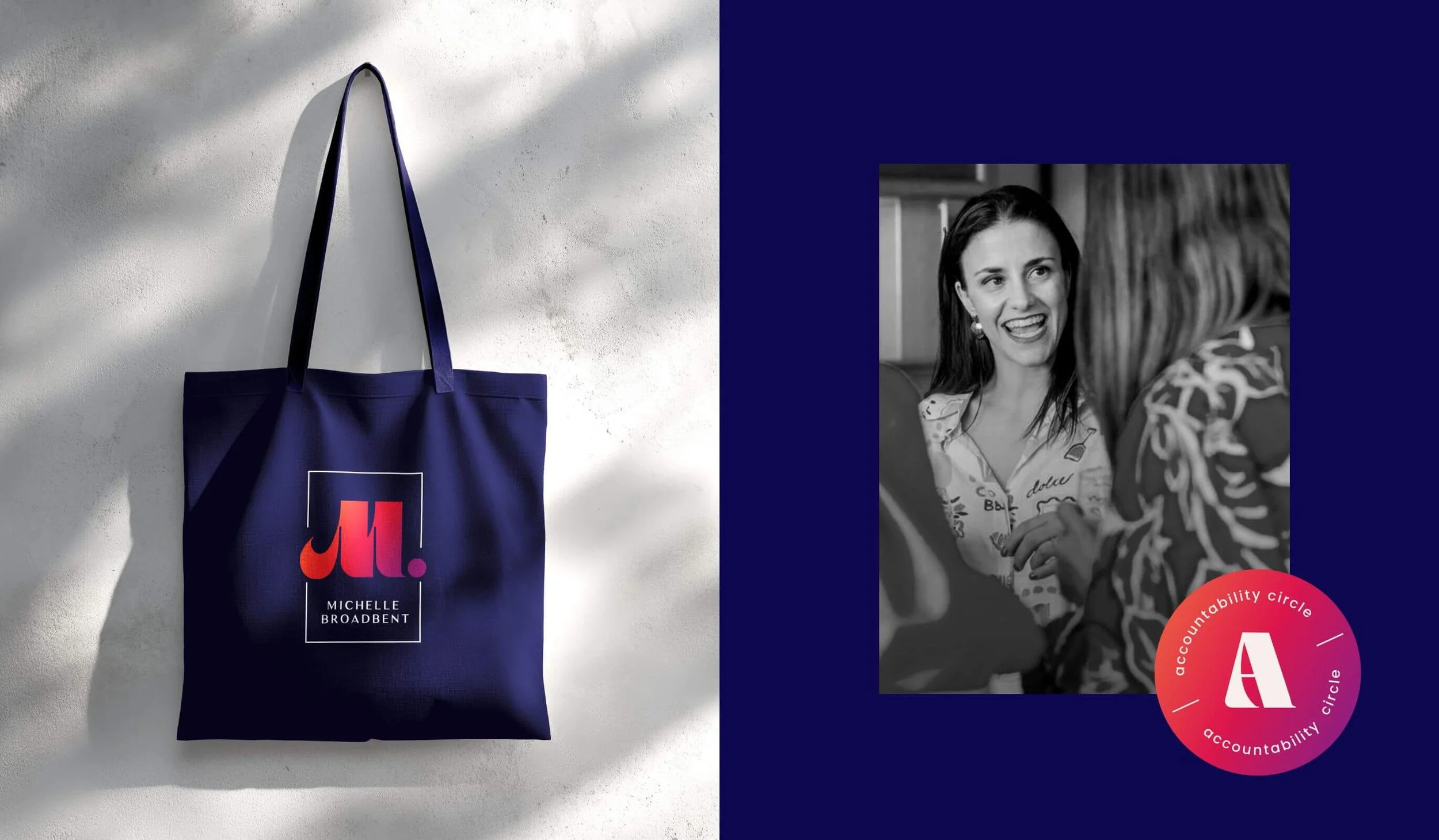
For typography, we chose a feminine typeface with thick, strong letterforms for headings that feel upbeat, playful and slightly quirky, bringing individuality and spirit. We paired a sophisticated serif for headings, with a relatable easy-to-read sans serif for body copy, balancing trust with approachability. The bold M brand mark was designed, to stand strong as an instantly recognisable emblem that delivers high visual impact across all touch-points.
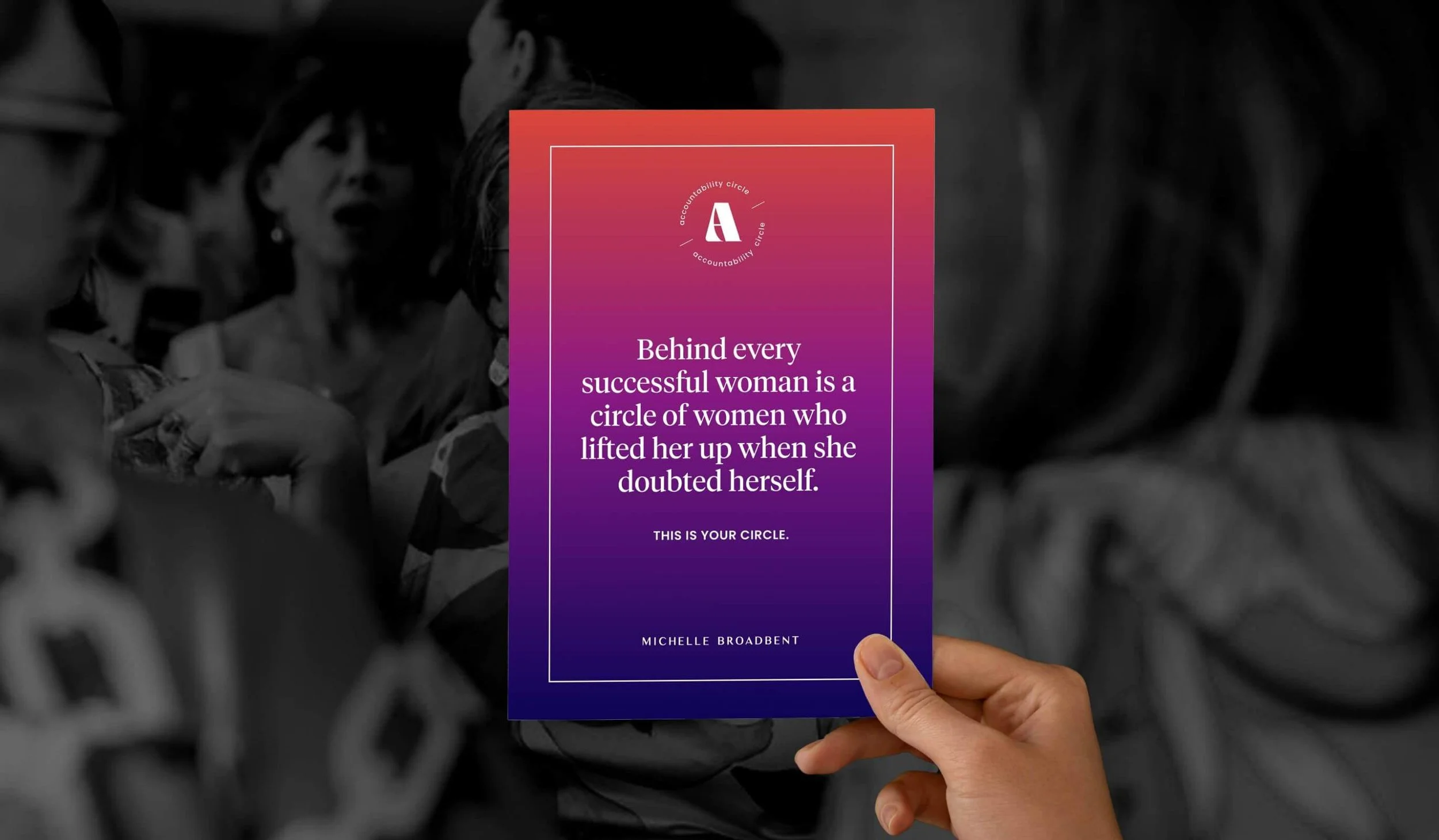
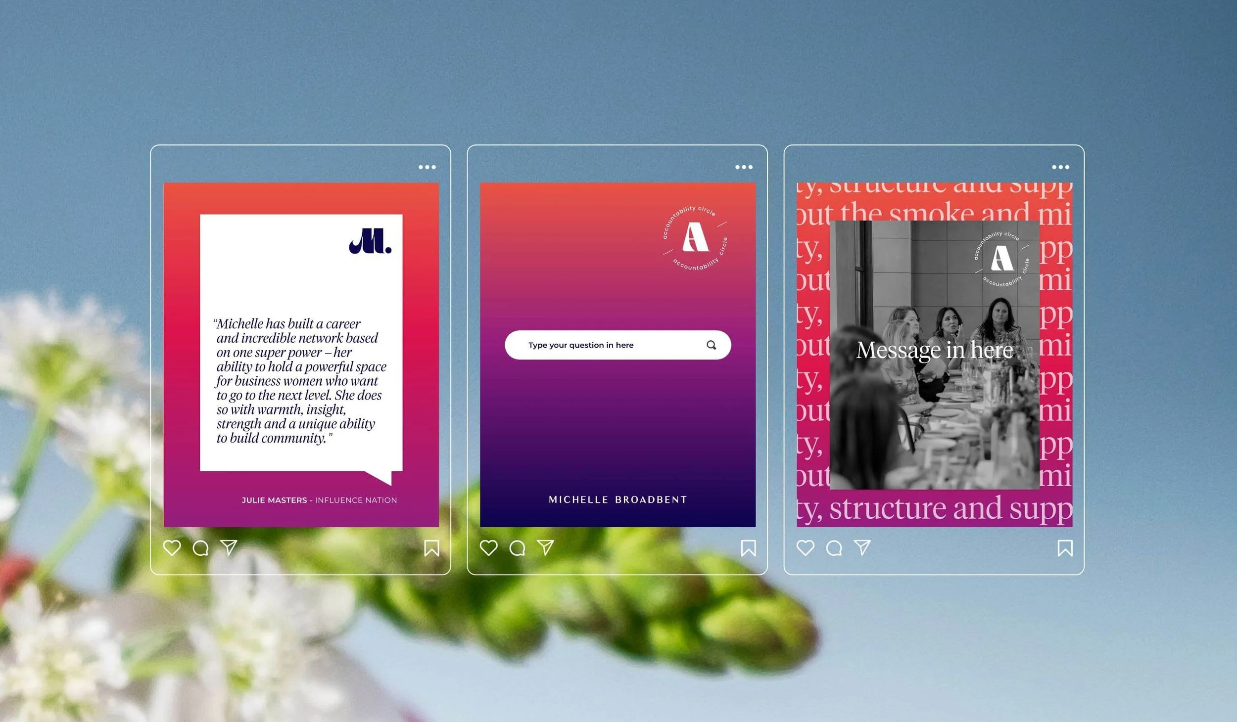
At the heart of this brand was the need to reflect Michelle’s powerful, warm and inclusive energy, alongside the community-driven Accountability Circle she leads. The brand had to function as a dual identity, with two distinct yet connected designs that could stand firmly on their own. This ensures that Michelle’s 1:1 clients engage with her directly whilst her Accountability Circle clients are part of a genuine community. There is a real sense of “Mastermind instead of Mentorship” with this brand and Michelle could not be happier with the result.

From the initial briefing through to the final concepts, I felt seen and understood. I don't know how many times I said "You get me" but you really do - it's a gift. And because of this, the results capture the true spirit of me and my business. Thank you for creating a visual identity that I am so proud to showcase