Sabel Studios
What started as just a logo project quickly morphed into a full blown brand creation as owner- Sarah quickly saw the benefit of an entire brand identity, so she could launch her new business with a bang.
MARKETING MATERIAL
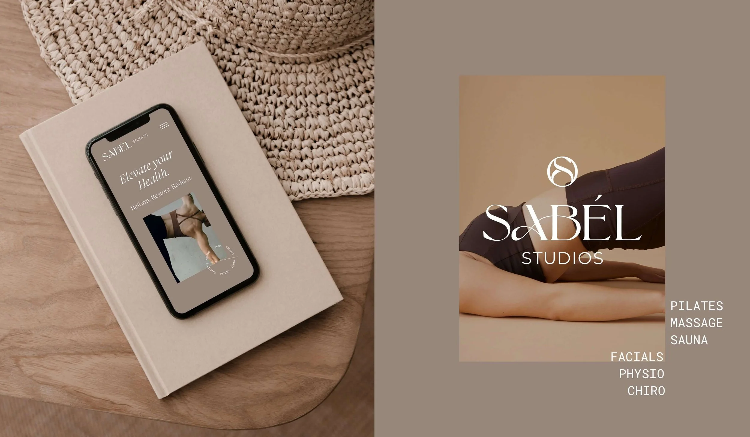
The vision for Sabel Studios was to create a wellness sanctuary where every woman could embrace her strength, find balance, and nurture her whole self. The new brand needed to capture community spirit and be all about supporting women.
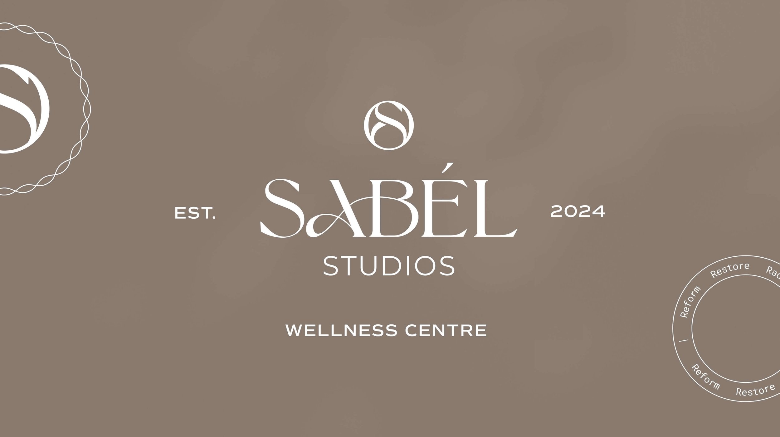
From the beginning the brief was to create a sophisticated mark that echoed the range of services Sabel Studios provide. We opted for a luxe design, with a modern air and relaxing vibe. Then we created a logo that blends together the A + B indicating the connection/stretching component of the services they provide (pilates and rehab - massage, chiro, physio).
The logotype and icon form an intentional design system that brings sophistication and adaptability to the brand identity. The "S" icon elegantly abstracts the hourglass shape of the abdomen, creating a distinctive mark that resonates both independently and in harmony with the logotype. This considered approach ensures the visual elements tell a cohesive story while maintaining their individual strength across every application.
The colour palette was chosen to imbue a mix of relaxing tones of cream, pink, navy & funnily enough the lead tone of mocha (coffee) brown that we selected was also chosen as the Pantone colour of the year 2025. Trendsetters for sure.
We created a whole suite of items for Sabel Studios with our brand package from; Business cards, to appointment + referral cards, an email signature, an A-frame and a massive set of social media templates so they will be able to sell hard online.


Her attention to detail and dedication were outstanding, resulting in a perfect brand identity for us. We've already received countless compliments on the logo and overall branding. The complete brand package has been instrumental in moving our business forward. She truly is a branding guru!