ACCRAC 2025
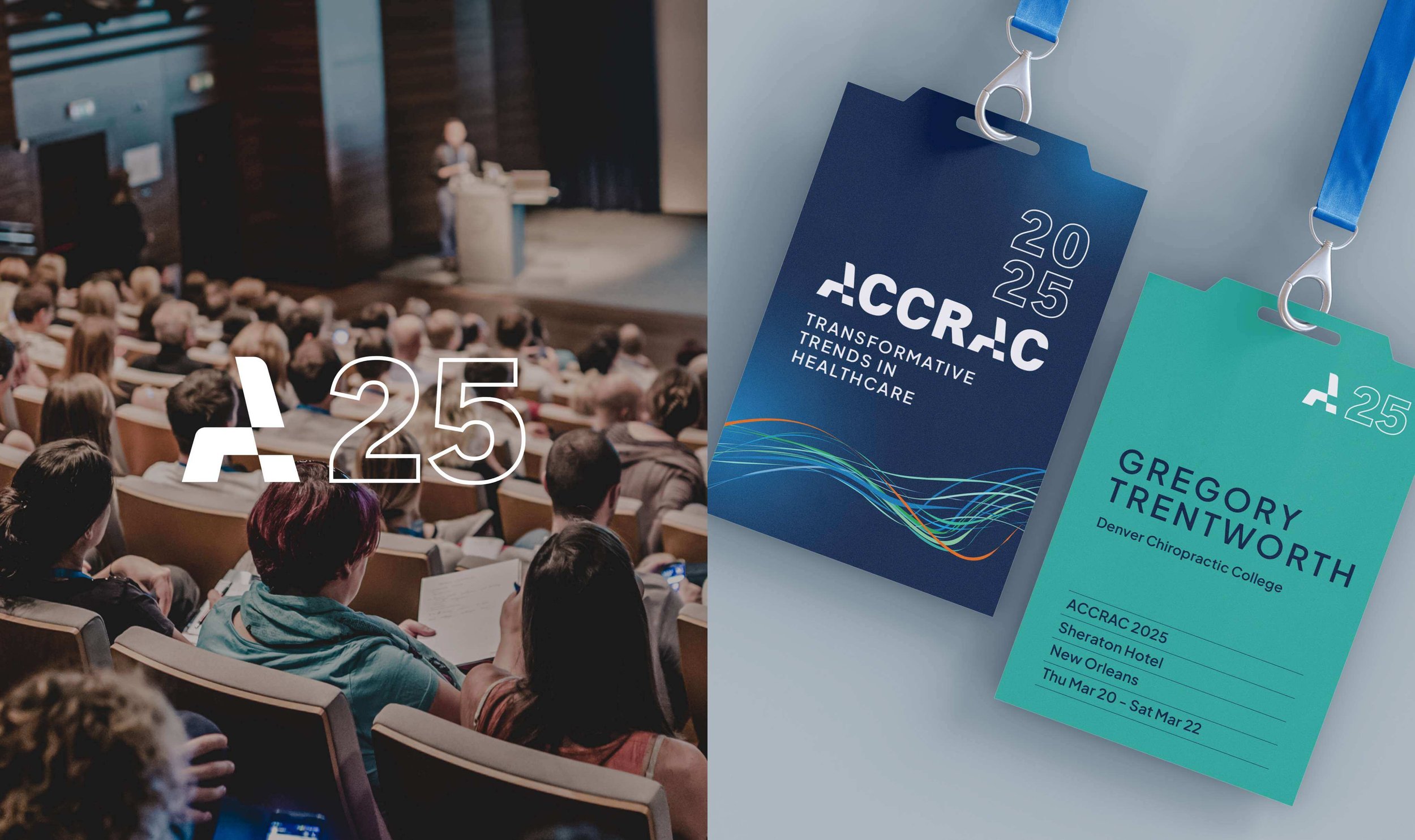
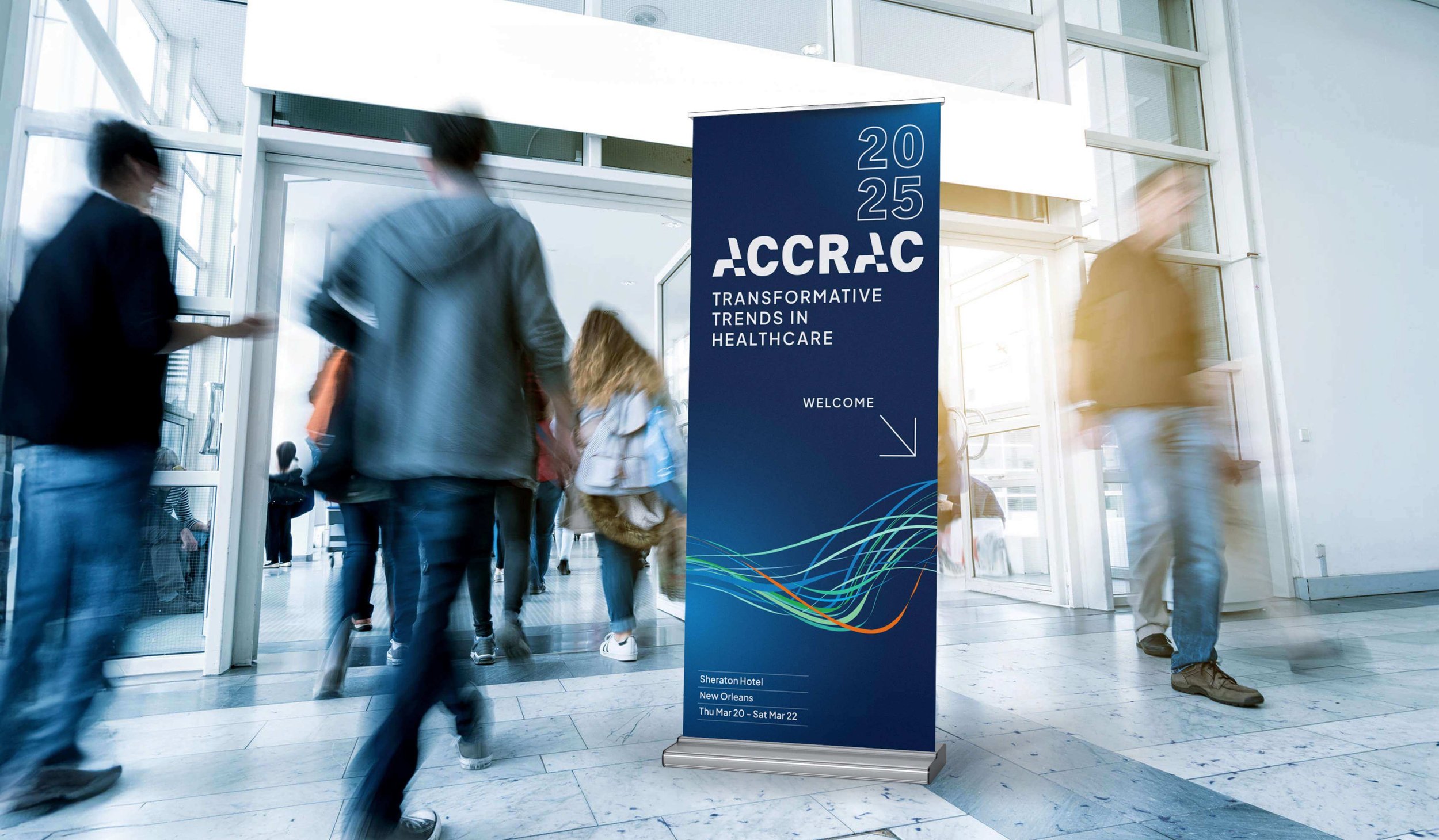
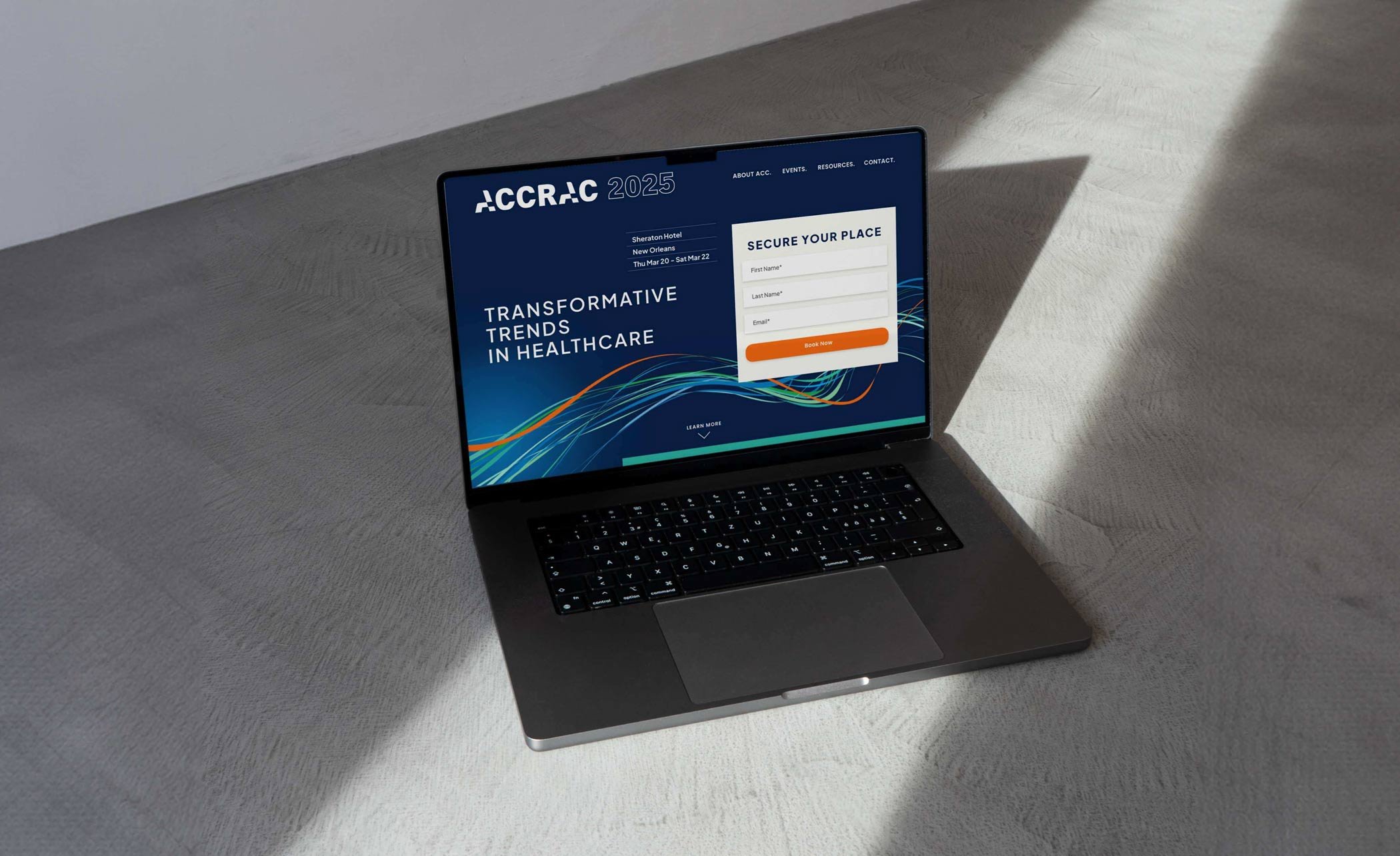
At the heart of ACCRAC 2025 lies a visual identity that captures the essence of chiropractic excellence.
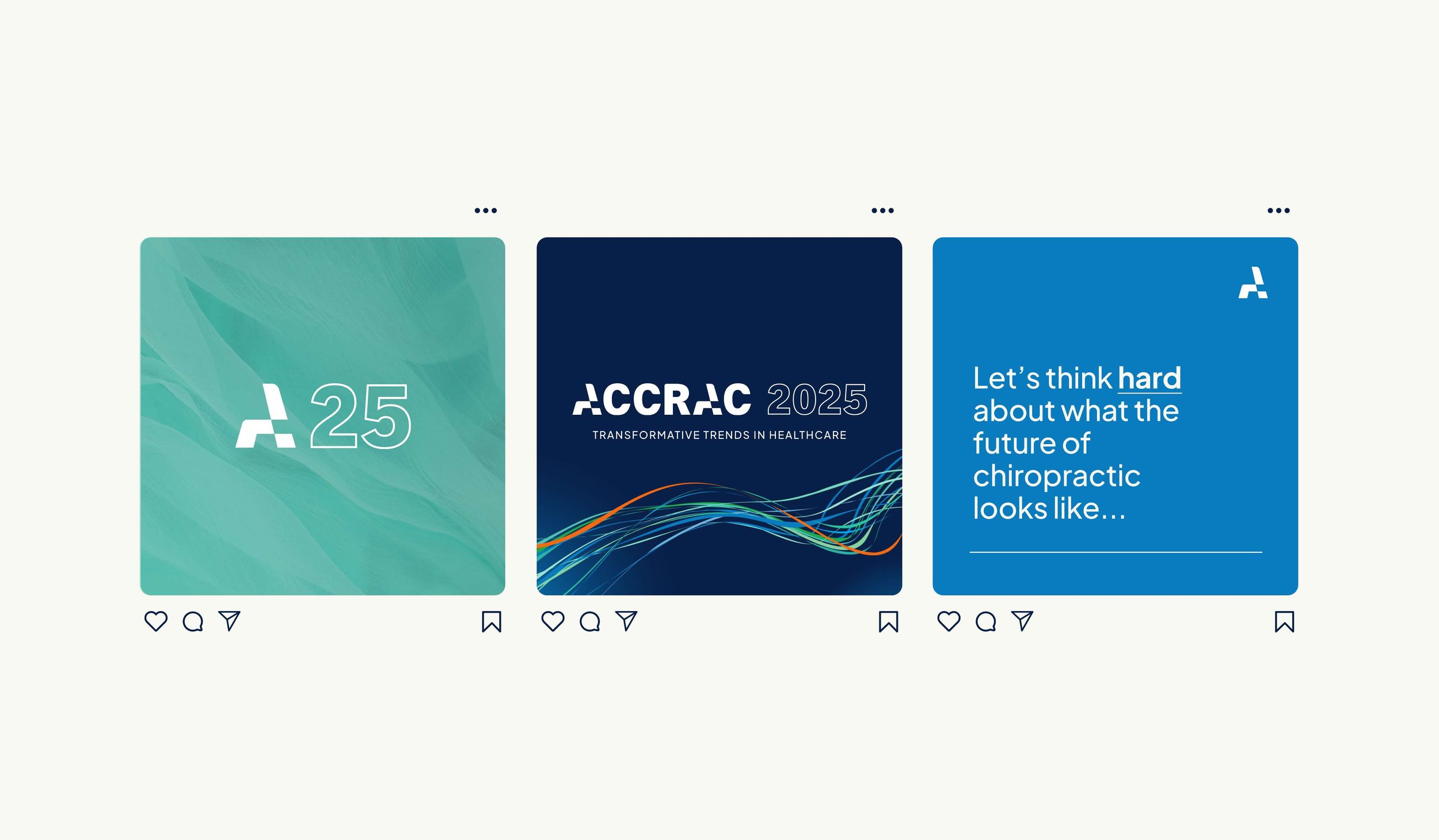
The new ACCRAC brand identity revolves around three core themes: Confidence, Modernity, and Trustworthiness. Through meticulous design, we crafted a logo that stands as a bold emblem of these values. The primary focus for the logo design is to create a confident and bold mark that stands proudly on its own, embodying the essence of the conference. Delving deeper into the design, the logo’s shape subtly evokes the interplay of muscles and cartilage supporting the spine—conveying strength and confidence. The structures of the A float seamlessly, reminiscent of the cohesion between muscles and cartilage, and how they work together to support the spine.
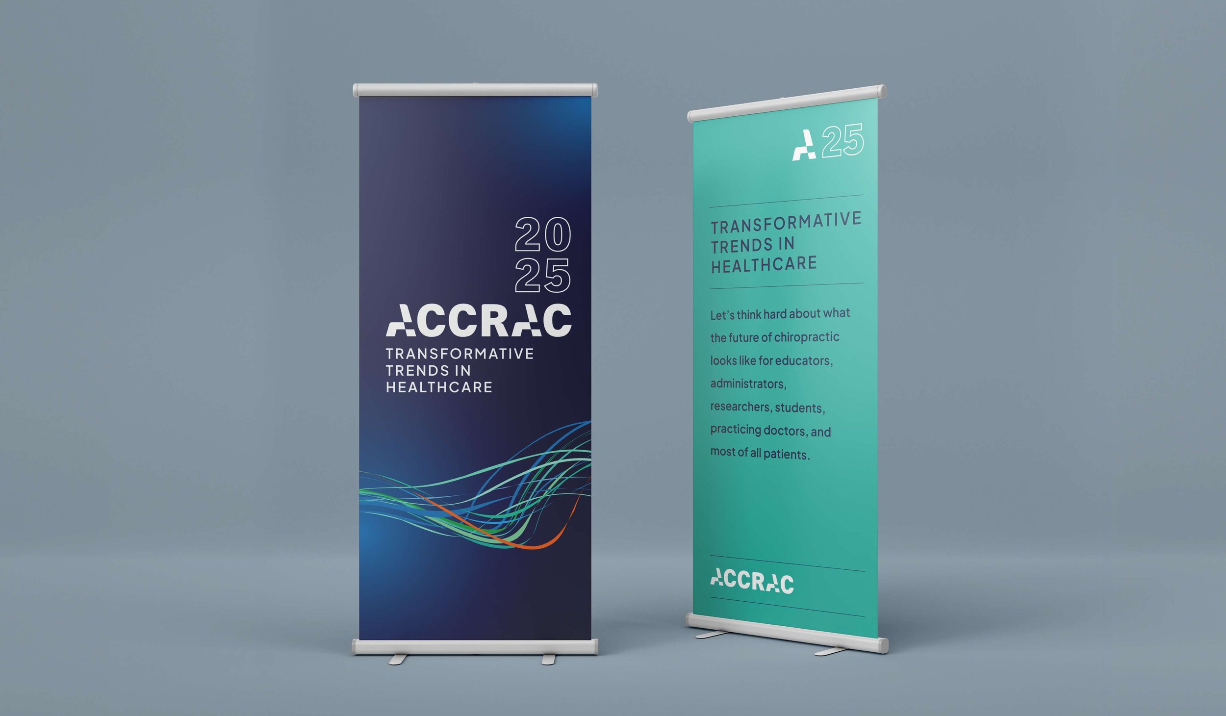
Accompanying the logo is a captivating narrative brought to life through imagery. A hero image of a visual representation of the spinal cord pulses with energy, symbolizing the dynamic movement of ideas and innovations within the chiropractic profession. Complemented by imagery of human body structures—muscle layers, blood flow, and tissues—our visuals convey the interconnectedness of healthcare and represent the idea of holistic health. .
Color plays a pivotal role in the visual identity, conveying professionalism and energy in equal measure. A deep, trustworthy blue grounds the brand, while vibrant orange injects enthusiasm and vitality. Modern aqua accents and grounding green hues complete the palette, reflecting the dynamic nature of our conference and the forward-thinking spirit of our attendees.
COLLABORATORS:
Animation: Sarah and Lachlan


From my perspective it has been a great process that ran very smoothly. We were looking for some visual branding to really lift the ACCRAC conference and convey a sense of professionalism. From my perspective it seems that the conference has excellent substance, and with the new visual brand you came up with, I think it has the visual appeal to match.
The best part of the design process for me was the reveal of the first 2 concepts – to see the brief translated into form was amazing. I appreciated the last minute planning to ensure we had enough for the brand reveal, and the extra legwork you did to find us an animator. Very much hit the mark – well done and thank you!
