7 mistakes you’re making when it comes to your website
As we’re learning, the online world and robots are slowly ruling us, at this point they may or may not take world domination.
Kidding, maybe… 😳
Now, I think we can all agree that when you have a good online experience, it’s one you’ll take a mental note of to tell people about or remember for the future. Convenience! It’s what we’re all about.
This is why as a business owner it is SO important to make sure your audience has a great user experience too.
When was the last time you went through your website as a client would? Things (especially WP websites) can often have little hiccups every now and again, so a review at least once a quarter can be a great thing to do to ensure your website pages are still hitting all your targets.
As a brand and web designer we know we are all about the strength of your brand messaging, visuals and the user flow but what about all the techy back end stuff that might be stopping people from having the best experience possible?
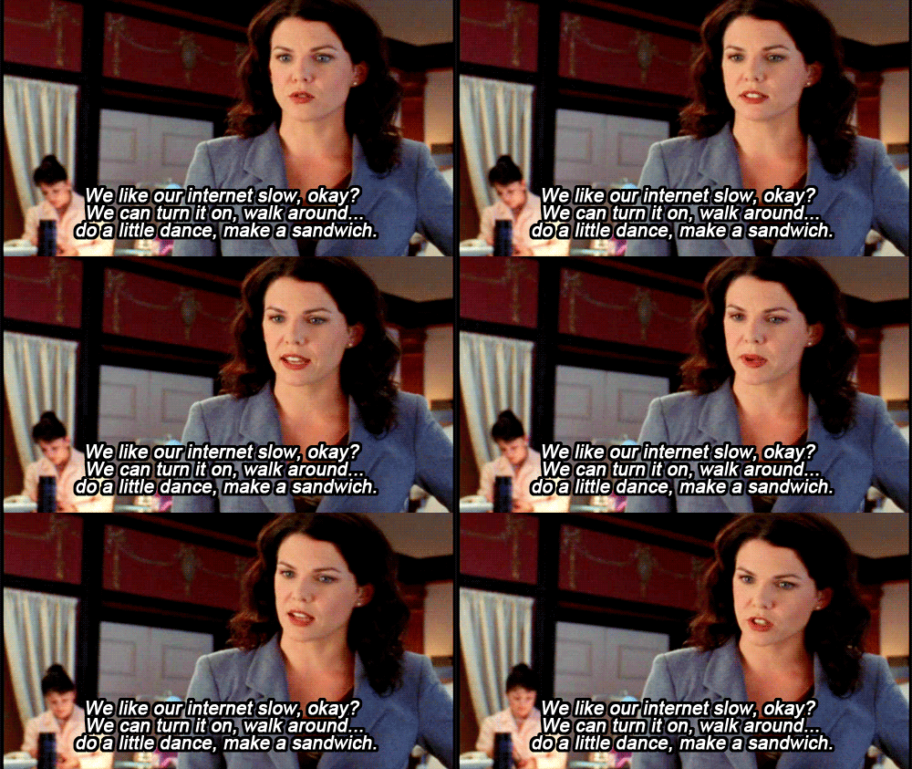
We love a sandwich break but there are not enough hours in the day as it is right!?
When you’re next deep diving through one of the many pages of the world wide web have a think about how your experience on particular websites makes you feel. Are you frustrated by certain things or are there elements on the website which make your life easier? It's important to be aware so that you can ensure your website is doing all the right things.
So, to get you thinking about your websites user experience, we have compiled a few SUPER important things to stay on top of when it comes to your website:
1. Simplify your navbar!
Having too many links and options in your navbar is a real no no. Yep, decision fatigue is real people. Simplify your nav bar and keep it concise. Remember, you can always use your footer for all those pages that are a little less important.
2. Consider your mobile formatting and layout.
Sometimes we forget about optimizing the website for mobile devices. Make sure you’re not missing out on potential customers because of a poor mobile experience. I’m sure we can all picture a bit of a dysfunctional website we’ve used on our mobiles and boy it is frustrating!
3. Consider your graphics files and logos.
If you’re using a jpeg or png file your logo won’t scale up or down depending on screen sizes. Best practice? Where you can use SVG files for your logo and scale any other images at double size so they wont lose their sharpness on hi-def screens.
4. Not using correctly sized images.
This can be a biggg one and images that are too big in size will slow your website down drastically! Equally, images that are too low in quality are going to make your site feel unprofessional and less credible. Ain’t nobody got time for that! As a general rule, in Australia where our internet is one of the slowest in the world (I kid you not), compress all images to be under 200KB.
5. CTA Buttons!
Remember to include call to action buttons throughout. Make it clear what you want visitors to do on your site and increase conversions.This can also be good to take your audience directly to information they want to know more about.
6. Remember your analytics people
I think we can all agree we can't improve what we don't measure, right?! Make sure you are tracking your website performance and analytics so you can make data-driven decisions.
7. SEO is key!
Ignoring your SEO? Or don’t quite understand it? Your website won't rank high on search engines without proper optimisation. We are not SEO professionals (but we can SO introduce you some if you need - just ask).
How do we feel? Has this got you thinking about some boxes which might need ticking on your website?
Our calendar is always open to discuss adding some extra ‘WOW’ to your website.
Book in a chat at any time here! Now…time for that sandwich break.
Zoë x
LIKE THIS AND WANT MORE?
If this is the kind of content that speaks to you, follow us on Instagram. Or you can also sign up to our newsletter for weekly goodness delivered straight into your inbox. Yes, that’s right – Weekly Goodness – no-one hates SPAM email more than we do!


