Our favourite 404s
Now, you very well could be wondering what the heck is a 404 Zoë.
I’m glad you asked…let me explain!
What is it?
Basically a 404 page is a HTTP error code, this appears when a webpage you might be seeking cannot be found. This 404 page is a helpful tool that allows users to be advised that this certain webpage is unavailable.
Sometimes a page may have been deleted or moved, or simply the link is broken. It can even just be there to indicate that the user may have typed something wrong. Whatever the cause, you can use 404’s as a great opportunity to create a page that directs your audience to the right place & you can put a smile on their face in the process!
Why are they important?
It’s important to note that no matter how organised you are with your website, sometimes breaks happen - it can be from missing content but also from simple typos in urls! This is when the beauty of 404s can come in handy, they can either educate, or bring some fun to the table for your audience.
With the combination of some clever copywriting and a good choice of imagery your 404s can really uplevel the experience when something breaks. Turn a potentially frustrating user experience into something they can have a giggle about! Think about this as another opportunity to add brand personality and flip around the frustration.
Take your audience from this…
To this…
What can you add to it?
The options really are endless! You can use it to bring humour, educate, stimulate discussion, push them in a different direction or apologise. Be creative with this and run wild! There are no rules here.
My last piece of advice is to regularly check your site for broken links (using an online broken link checker like this one here>
Here are some ideas to get you inspired:
Some of our client faves:
Our client TM Solicitor has added a humorous message to her 404 page along with a gif to help guide people back to her home page.
We have also opted for a bit of old-school houdini magic to give our audience a bit of a giggle.
And other faves:
We feel Financial Times have nailed their 404! Simply, it’s clever, 100% on-brand while also adding high brow humour to the table.
Gym Box have kept in well on-brand with an old aerobics class while giving their visitors a bit of a giggle at the same time!
Email Centre UK (no longer live)
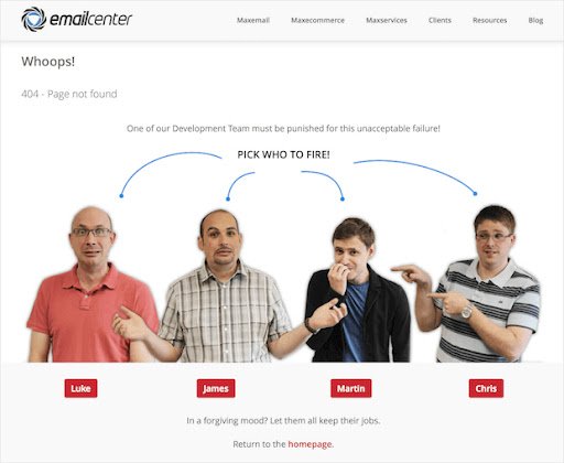
Although their 404 page is no longer live, they were able to have a good laugh and accepted the blame by asking which staff member to fire!
Designer Polo Garcia adds some great light humour with their 404 page. Expect the unexpected! While keeping their ‘take me back home’ button very clear and obvious.
We love the playful copy of this one and the illustration! Spotify get extra points for the use of a witty pun off Kanye West’s album “808s and Heartbreak”.
Video agency Myriad also opted for a very on-brand 404 page design that mimics the classic SMPTE color bars that we use to see on old tapes and TVs back in the day!
Ahhh Patagonia, clever, very clever. We love this. Error - Airer, need we say more! Fitting in very well again with their branding. A fun and friendly way to tell customers they’re in the wrong place.
This is one for the Star Wars fans. GitHub plays on a famous line from Star Wars for their 404 page! "These aren't the droids you're looking for" plays on a reference to Obi-Wan Kenobi's Jedi mind trick on Stormtroopers in Star Wars. It became a well-known phrase to tell someone they're pursuing the wrong course of action.
Keeping in theme and fitting in with their brand, this is a great little reminder to add some calm into the chaos. They've smartly incorporated their branding message here!
See! There really are no rules with this, have fun with it and add some brightness to your clients day, turn something frustrating and unexpected into a laugh or conversation starter!
Also take this as a reminder it’s great to double check your links!
LIKE THIS AND WANT MORE?
If this is the kind of content that speaks to you, follow us on Instagram. Or you can also sign up to our newsletter for weekly goodness delivered straight into your inbox. Yes, that’s right – Weekly Goodness – no-one hates SPAM email more than we do!


