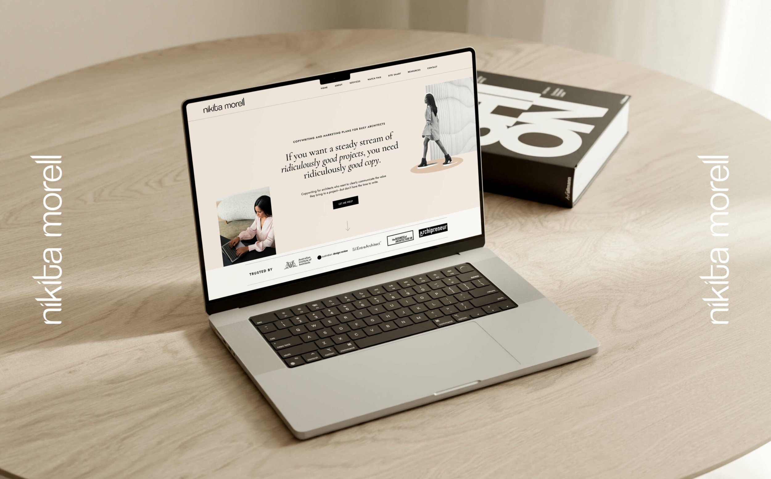
Nikita Morell
“Just as every line on a drawing matters, so does each letter in your logo matter!”
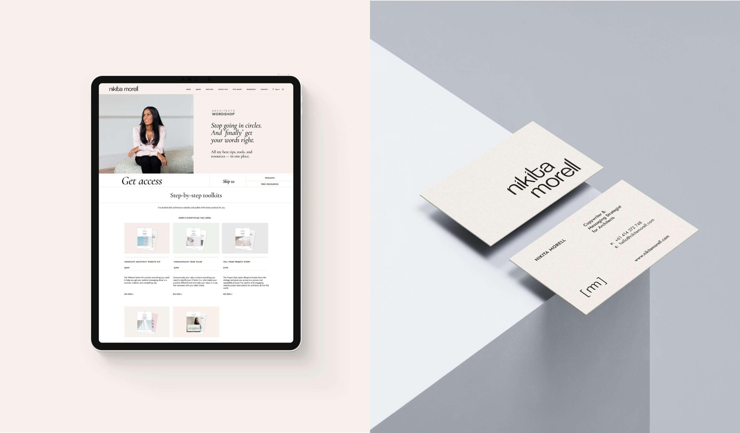
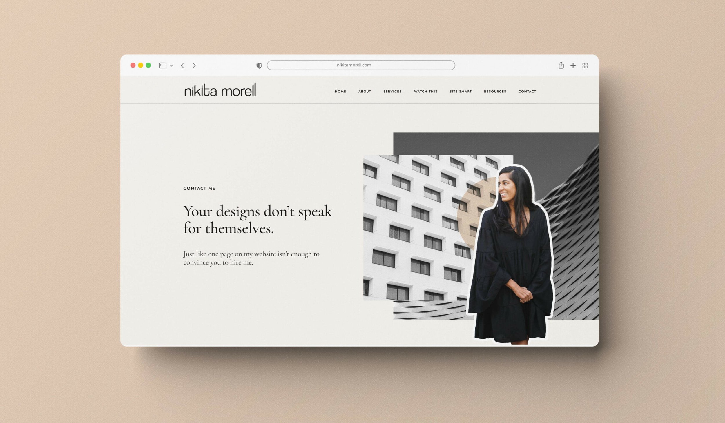
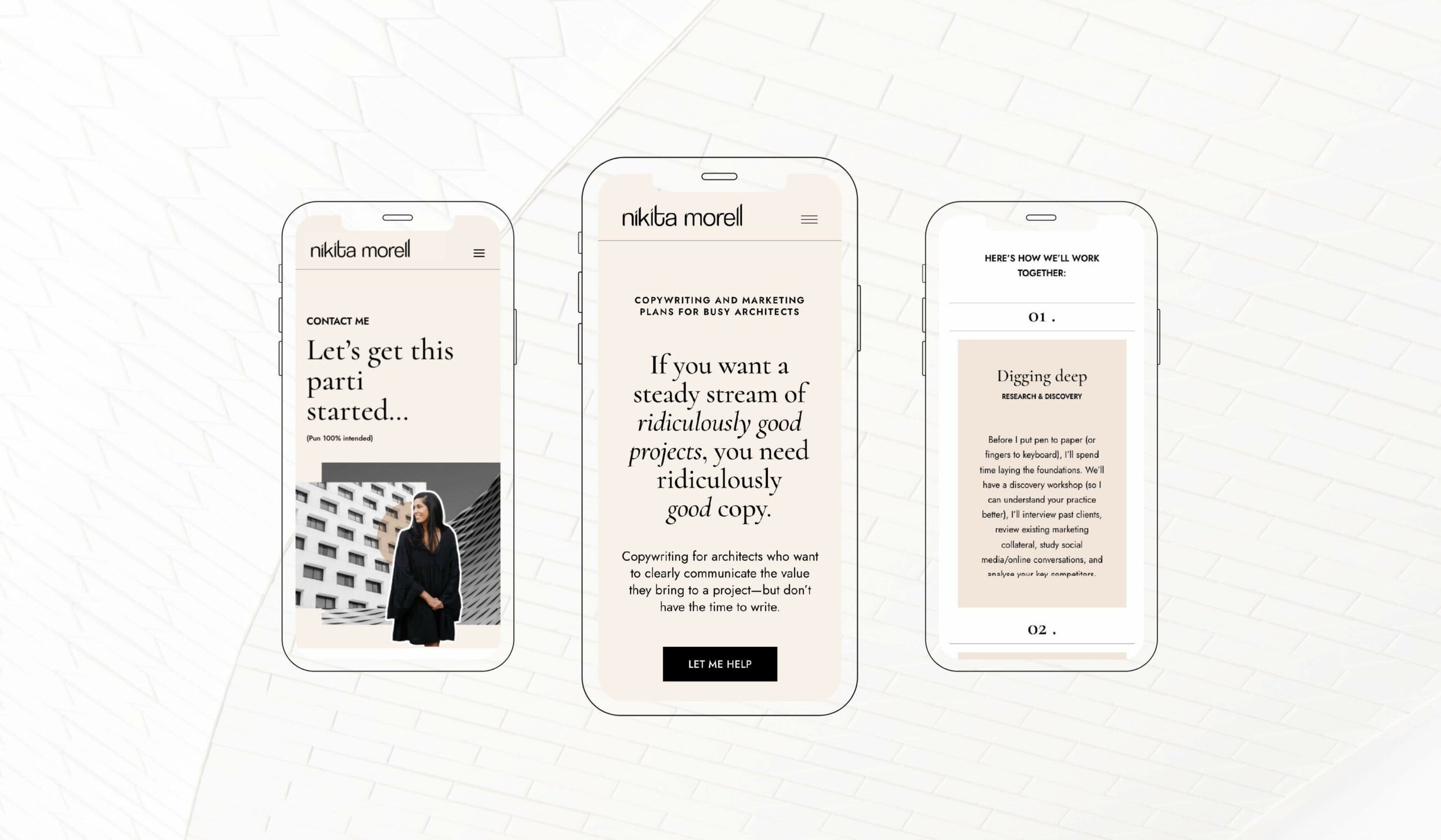
Website Design
Stationery Design
Long term and much loved client of ours Nikita is a successful copywriter catering to architects, she came to us to elevate her brand identity, urging for a vibrant and fresh logo that mirrors her persona. After brainstorming sessions, we embarked on crafting a logo that embodies the precision integral to architecture.
To represent Nikita’s humor, we chose a lively sans-serif font, incorporating playful elements like a curved “t” and a dropped point on the “k” for a casual touch. The tops of the letters are angled to evoke the shape of roof peaks, resonating with an audience of architects. This blend of whimsy and precision captures Nikita’s character while authentically reflecting the architectural theme, a challenging balance to achieve.
COLLABORATORS
Photography: Heist Creative
Words: Nikita Morell
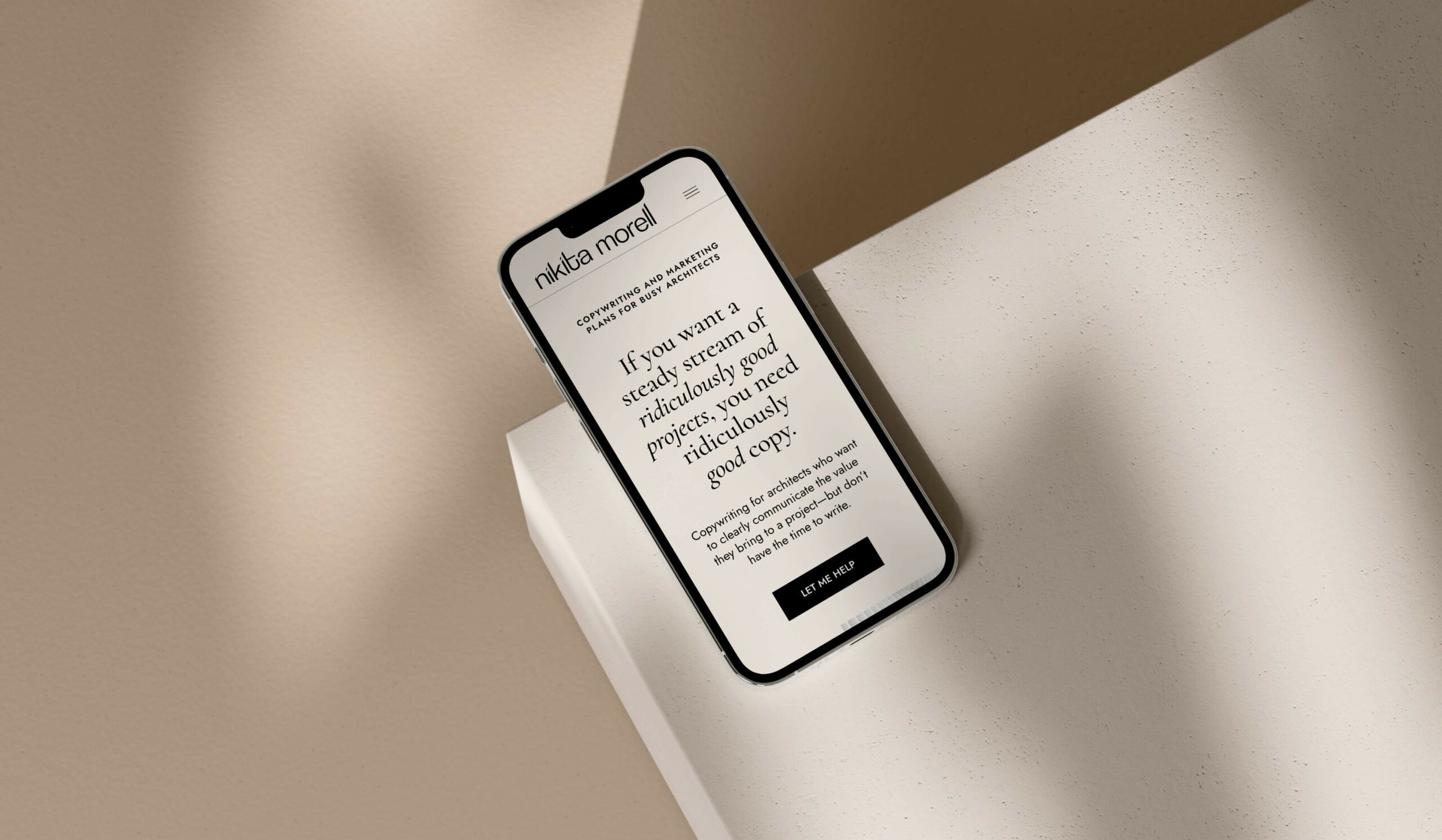
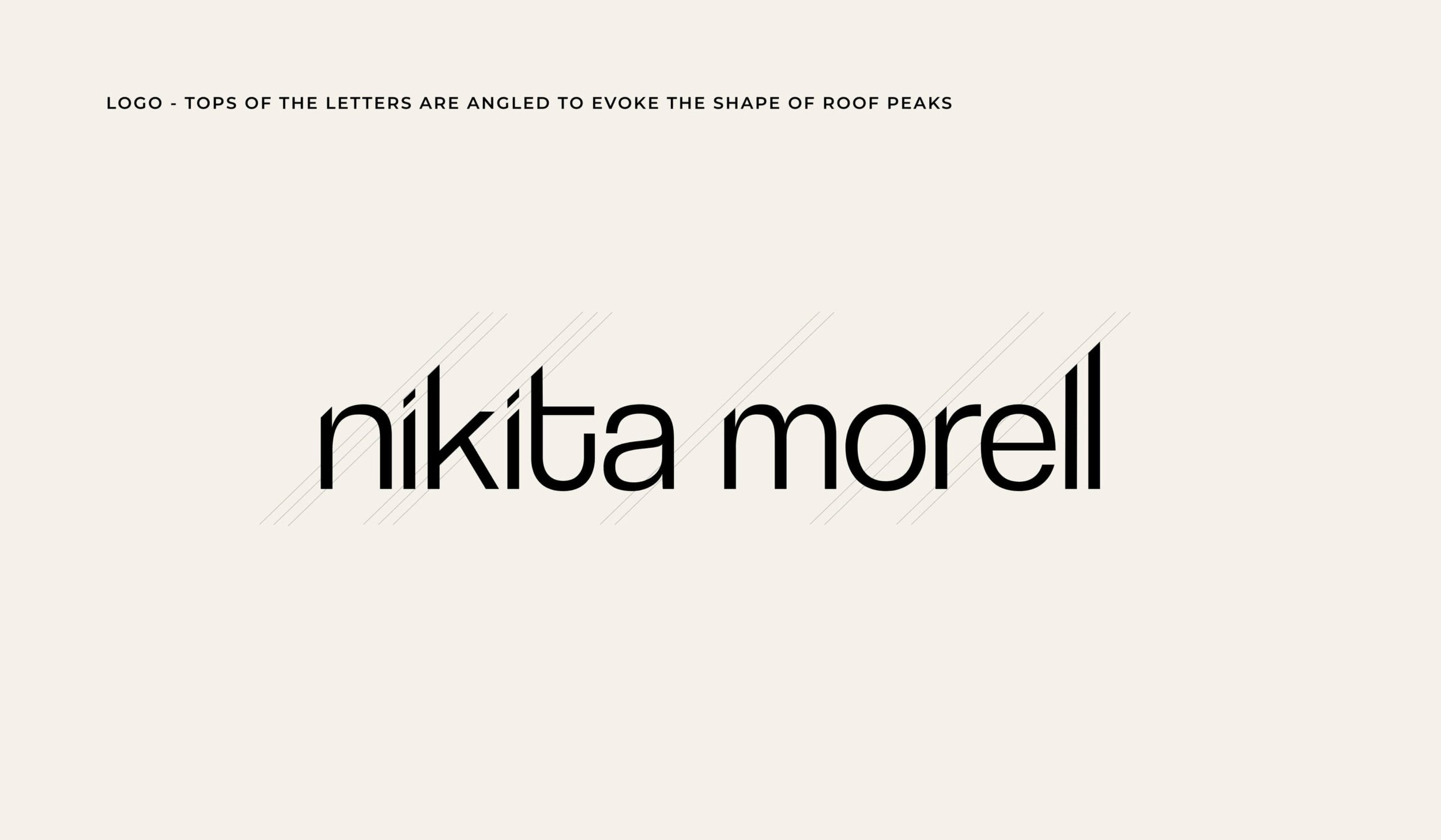
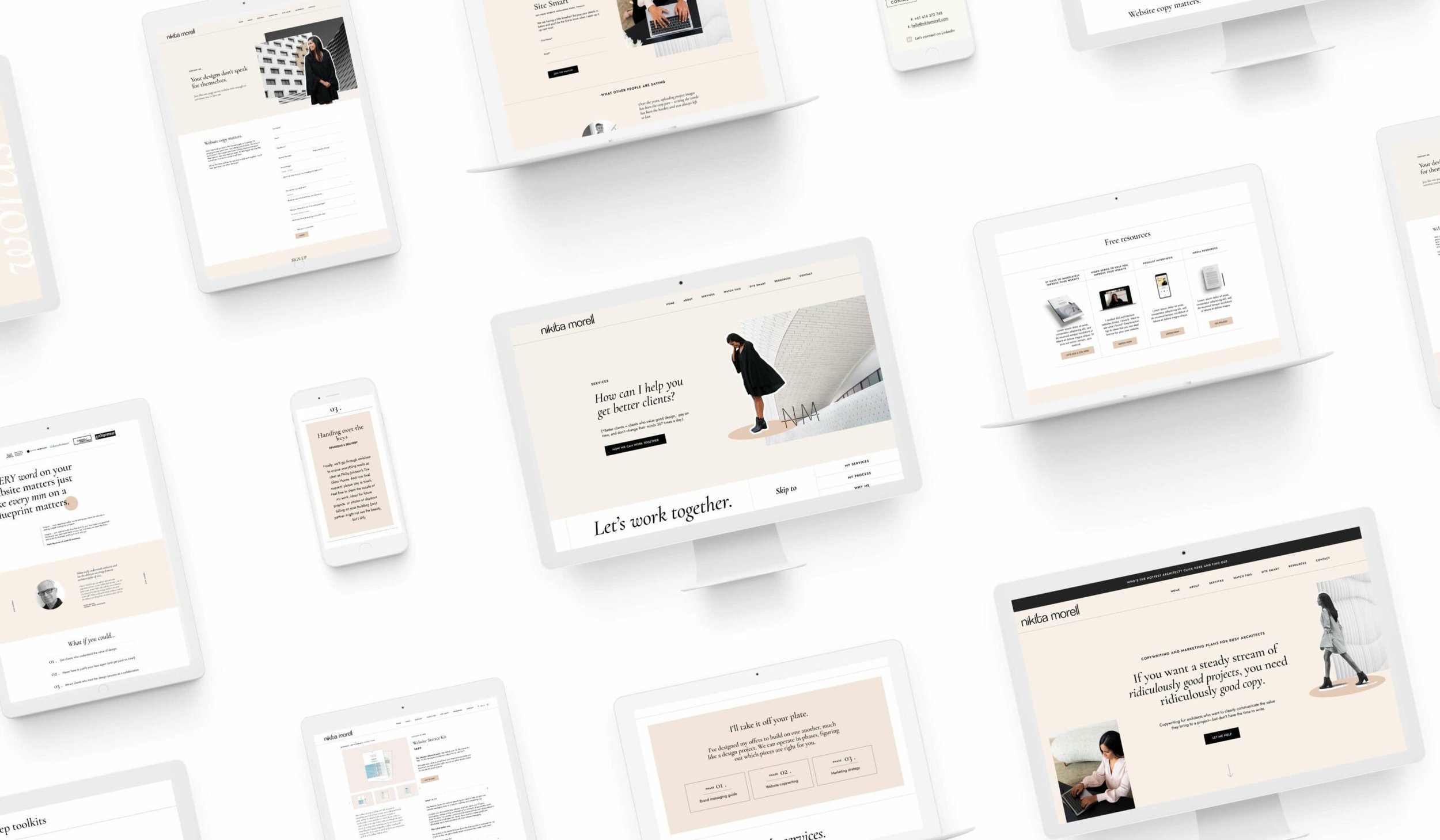
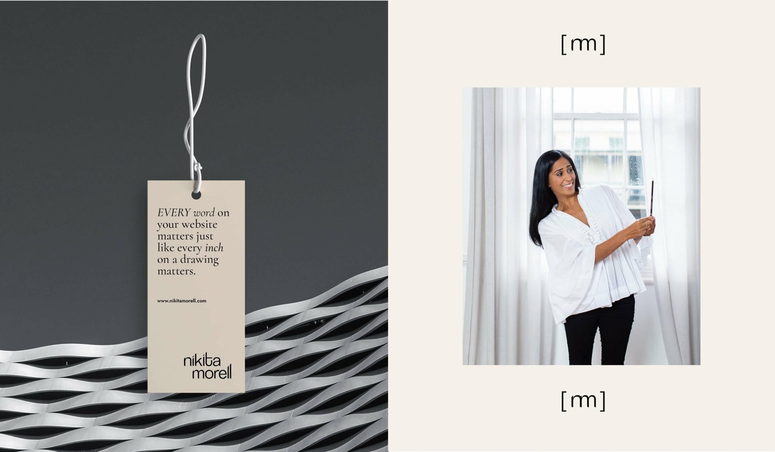
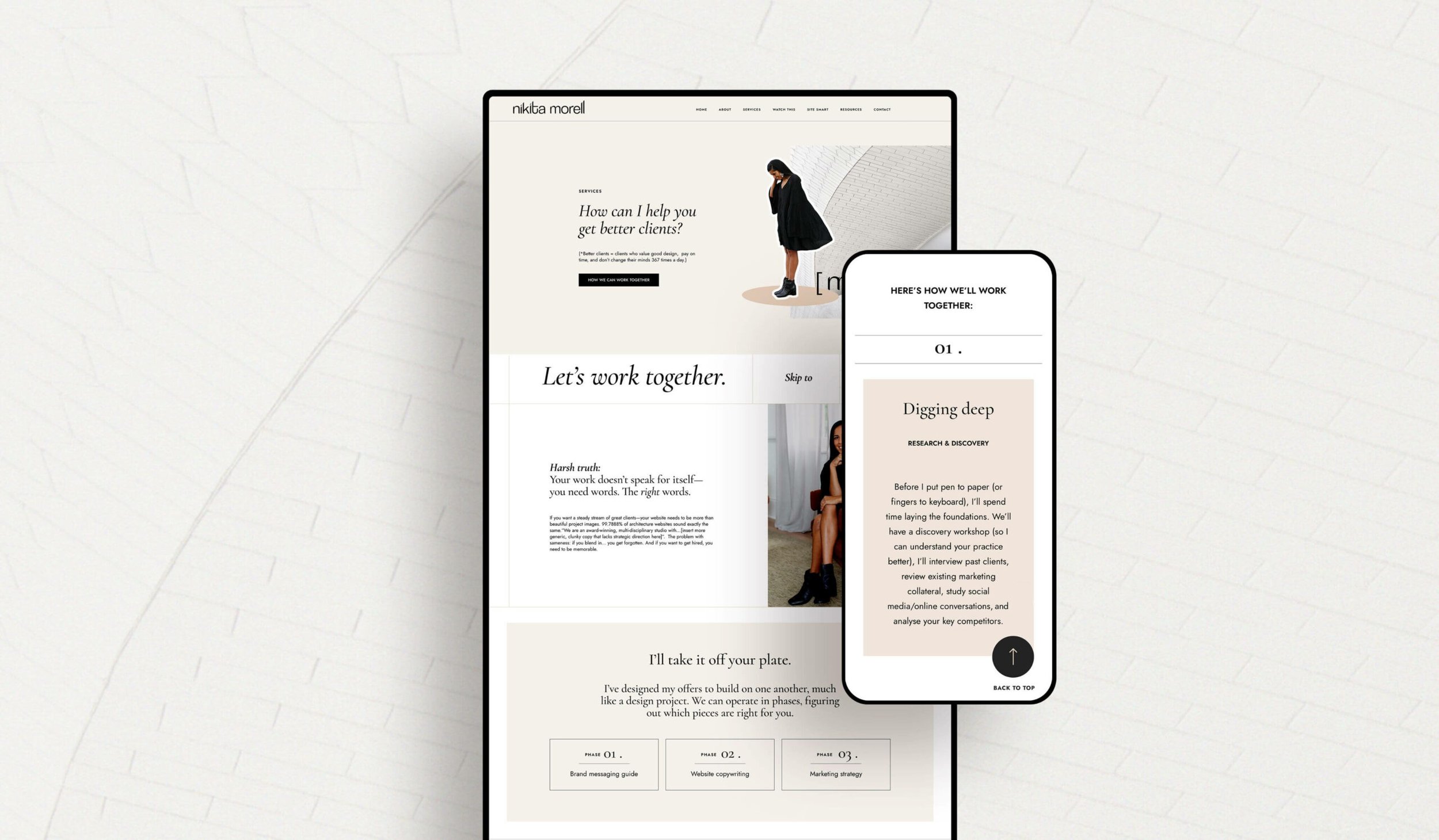

I’ve had the same DIY logo for the past 9 years. I decided it was (finally) time for a refresh. I wanted my logo to reflect the playfulness of my brand personality, but at the same time appeal to architects. Zoë Scott, nailed it. And whilst it may not be grammatically correct (all lowercase letters): I love the angles. I love the way the “ll’s” look like buildings. And more than anything else I love that it “feels” like me.
Your brand IS more than your logo. But, hot dang does it feel good when it reflects YOU.
