Unpacking the user experience – how to create an awesome website
You know what really gets my goat?
Free website builders who claim that a website can be built in less than an hour.
Like, maybe it is possible to build it in under an hour. But kind of in the same way it’s possible to homeschool your children during a pandemic. You may get the job (somewhat) done but the end result won’t be great, and everyone will end up feeling frazzled and dissatisfied.
I guess the main difference is, when it comes to making a website in under an hour you have a choice. Maybe you *can* do it but when you’re sure to end up with a not-so-great result, why would you??
Building a website for your business means sending your representation out to the big, World Wide Web. It’s out there for everyone to see and you’d want to be damn sure it accurately represents you. You need it to look amazing and it’s gotta be easy for your customers to use and to navigate. As a website designer with a tonne of experience, I can tell you these are not things you can do well, in under an hour.
Let’s take for example, the AirBnB website.
From the moment you click onto their homepage, you want to pack your bags and plan your holiday. The imagery is inspiring and the way it’s laid out makes it so eeeeeeeasy to choose the type of holiday which suits you. You can choose a specific location, you can pick a holiday destination based on its proximity to your home or, on the type of accommodation you’d like to stay in. In order to capitalise on the beautiful pictures they’ve used to influence your choice, there’s minimal text. And it really works!
When this site was designed, it’s evident that the end goal was to evoke the feeling of heading off on an adventure, in the simplest way possible.
Another example of an excellent website design is MailChimp.
While this website also uses gorgeous imagery, it differs from AirBnb in its use of text. Targeting business owners, MailChimp uses just the right amount of content to ensure their customers are informed in their decision making. With a static menu bar, no matter where you are on the website, there’s easy access to login, signup, pricing and the whole gamut of available options.
Easy to navigate, informative and super stylish. I can guarantee you, this is not a website built in under an hour.
If you’re looking to create a business website which provides the best kind of user experience for your customers, these are the kind of things you need to do.
Plan your customer journey and website goals.
The very first thing you need to think about when you’re designing your website is, what you want your customers to do when they’re there. If the goal of your website is for people to get in touch with you, it’s important there’s a visible Contact option on every page. If you’d like them to be able to experience your work, display it in the most appealing way possible and make it super easy to get to.
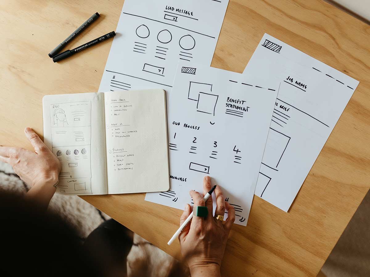
With your website goals and customer journey mapped out, capture it in a wireframe and blueprint. This will lay the foundation for your website and essentially guide its development.
Make it clear.
There’s absolutely nothing worse than heading to a website, specifically to make a purchase and instead finding yourself lost in a rabbit warren of intricate navigation. For your customers to have an awesome experience on your website, it’s super important to provide a simple menu. While you might be tempted to get creative with your page names, if in doubt err on the side of clarity.
Make it easy.
If there are key pieces of information that your customers should know about your products. Tell them!! And do it quickly! Now is not the time for flowery, lyrical prose or super technical, coded terms. Keep it simple with scannable text. By incorporating headings and bullet points, you create content which is easy to scan through. Your customers’ eyes will be drawn straight to the information they need.
Make it visually appealing.
It doesn’t matter if you’re selling spare parts or photography services. Beautiful, high-quality images are an absolute must on every website. Nothing will capture the heart of your audience more than big, emotive storytelling. Especially if it speaks to their needs and makes them feel understood.
If you’d like to know more about creating a beautiful website, complete with excellent user experience, we should talk. Get in touch to find out how to send the best version of your business out to the World Wide Web.
LIKE THIS AND WANT MORE?
If this is the kind of content that speaks to you, follow us on Instagram, or you can also sign up to our newsletter for fortnightly goodness delivered straight into your inbox. Yes, that’s right – FORTNIGHTY Goodness – no-one hates SPAM email more than we do!

